The Visual Editor API is designed for experienced CloudCannon developers. If you need help with custom integrations or your CloudCannon setup in general, please contact our friendly support team.
The Visual Editor uses built-in Data Panels A Data Panel is a panel of Inputs for editing a focused scope of structured data, such as image details, link attributes, or Site configuration. Data Panels appear in several places across CloudCannon — in the Visual Editor, in the Content Editor when you edit a snippet, image, or link, and in Configuration Mode, such as the Edit Advanced panel. Developers can also build custom Data Panels with full Input support using the Visual Editor API.Data Panel
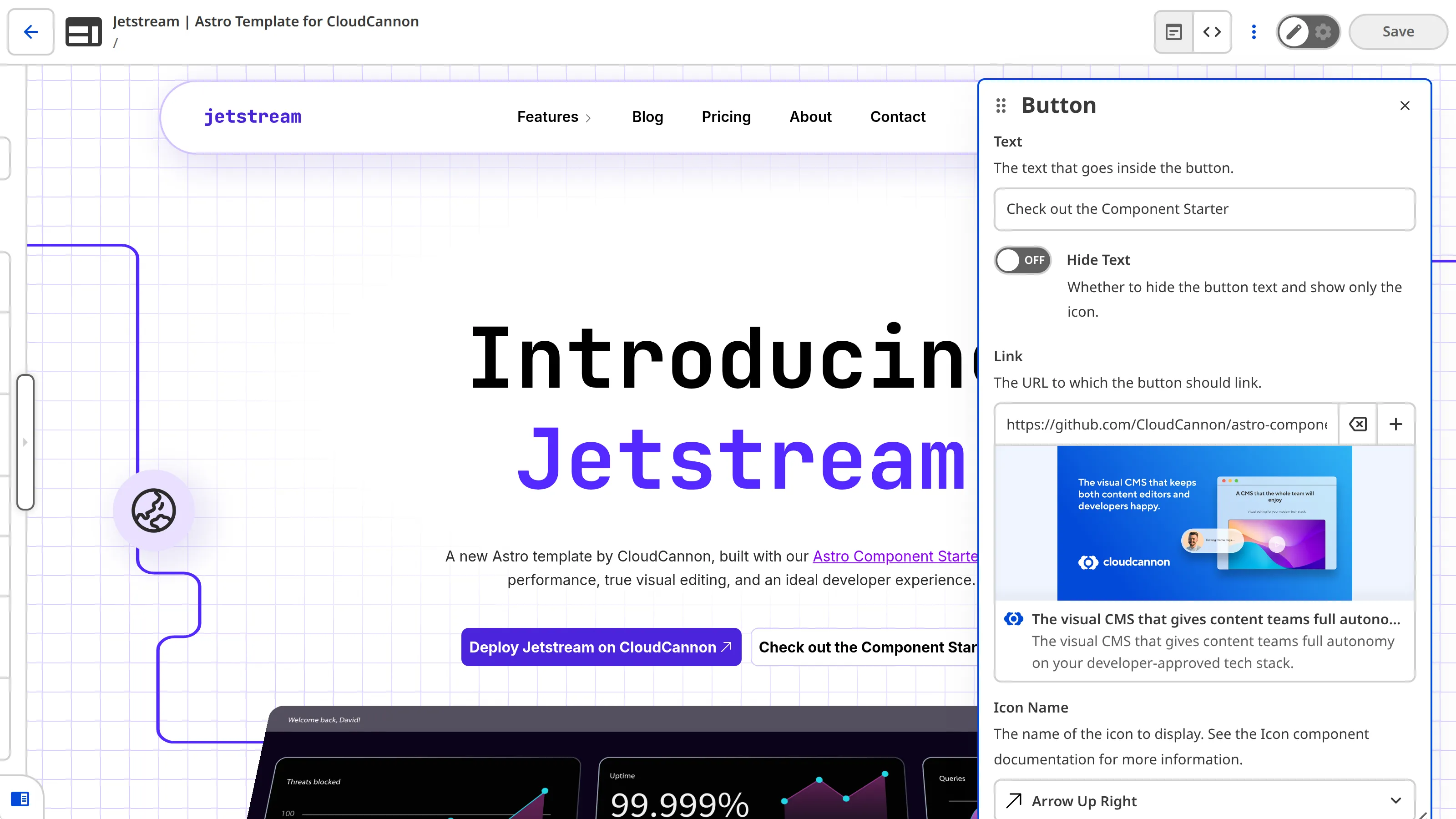
This article assumes you know how to initialize the Visual Editor API. For a complete list of API objects and methods, please read our reference documentation on the Visual Editor API.
Open a custom Data Panel with Input fields#
Calling An API object is an object that exposes an API's methods, so you can work with a service or system in code. In CloudCannon, the Visual Editor API provides an API Object as its entry point: call An editing interface for structured data in your data files or the Front Matter of markup files. Inputs appear in the Data Editor and the sidebar or data panels in the Content Editor and Visual Editor. CloudCannon supports twelve types of Inputs: Boolean, Code, Color, Datetime, File, Number, Object, Array, Select, Text, Rich Text, and URL.*.createCustomDataPanel() on the API ObjectAPI Object
useVersion() on window.CloudCannonAPI to get it, then use its methods to access files, Collections, and Datasets, read and write content, listen for changes, and build custom integrations in the Visual Editor.Input
To open a custom Data Panel:
- Open your website files in your local development environment.
- Open the JavaScript file where your Visual Editor API integration runs.
- Add a call to
*.createCustomDataPanel({...})in your script. - Add the
titleproperty, where the value is the heading for your Data Panel. - Add the
onChangeproperty, where the value is the function CloudCannon should call whenever a Organization Memberchanges a value in the Data Panel (e.g., using the new data to update your custom integration). CloudCannon passes your function the full updated data object, not a diff.Glossary termOrganization Member
A person who belongs to the same Organization as you. Organization Members are other CloudCannon users who have been invited to your Organization to collaborate on Sites, edit content, or manage settings. Each Organization Member has their own CloudCannon account with individual permissions assigned through Permission Groups, and uses one Seat in your Subscription Plan. Organization Members were previously called Team Members.
- Optional. Add the
dataproperty, where the value is an object whose keys are Input field names and whose values are the default values for those fields in your Data Panel. - Optional. Add the
configproperty, where the value is the_inputsobject, containing Input configuration in the same structure as in your CloudCannon Configuration File. - Optional. Add the
idproperty, where the value is a unique string that identifies your Data Panel, so you can close it later and reopen the same panel instead of opening a duplicate.
const api = window.CloudCannonAPI.useVersion('v1', true);
document.querySelector('#open-image-seo-panel').addEventListener('click', async () => {
  const panelId = await api.createCustomDataPanel({
    title: 'Image SEO',
    onChange: (updatedData) => {
      const img = document.querySelector('#hero-image');
      img.src = updatedData.image;
      img.alt = updatedData.alt_text;
      img.title = updatedData.title_text;
      img.loading = updatedData.lazy_load ? 'lazy' : 'eager';
    },
    data: {
      image: '/images/team-photo.jpg',
      alt_text: 'CloudCannon team collaborating at a whiteboard',
      title_text: 'CloudCannon team',
      lazy_load: true,
    },
    config: {
      _inputs: {
        image: { type: 'image', label: 'Image' },
        alt_text: { type: 'text', label: 'Alt text' },
        title_text: { type: 'text', label: 'Title text' },
        lazy_load: { type: 'switch', label: 'Lazy load' },
      },
    },
    id: 'hero-image-seo-panel',
  });
});Listen for a click on the element that should open the Data Panel, such as a button in your custom integration.
api.createCustomDataPanel() opens the panel when the handler runs; the awaited value is the panelId string.
Set the heading of the Data Panel to "Image SEO" using the required property title.
Set the function CloudCannon should call when an Organization Member makes a change using the required property onChange. You can use the updated data object to update your custom integration, for example syncing a preview <img> (#hero-image) with image, alt_text, title_text, and lazy_load here.
Set the Input fields and default values using data.
Configure the Inputs from the data property using config. For more information, please read our documentation on Inputs.
Set the unique id. When set, the resolved panelId matches it; omit to let CloudCannon assign a random id. Reopening with the same id reuses the existing panel instead of opening a second one, so triggering the action again won't stack duplicate panels.
For more information on configuring Inputs, please read the documentation specific to each Input type: Array Inputs, Boolean Inputs, Code Inputs, Color Inputs, Date or Time Inputs, File Inputs, Number Inputs, Object Inputs, Rich Text Inputs, Select Inputs, Text Inputs, and URL Inputs.
When using *.createCustomDataPanel(), the call resolves to a string panelId. This will be either the id property you defined, or a random seven-character alphanumeric string using digits 0–9 and lowercase letters a–z (base 36), such as k4j92xq. A new value is generated each time you open a panel without an id. Treat it as an opaque token you store and pass back to *.destroyCustomDataPanel(), not as a UUID or a pattern to parse.
Close the panel#
The *.destroyCustomDataPanel() function closes a custom Data Panel that you opened with *.createCustomDataPanel(). *.destroyCustomDataPanel() accepts the value of the id property, or the panelId string that *.createCustomDataPanel() returned if you did not set one.
Ensure you stored the panelId string from when you opened the panel (for example in a variable, on a component instance, or in closure scope).
To close a custom Data Panel:
- Open your website files in your local development environment.
- Open the JavaScript file where your Visual Editor API integration runs.
- Add a call to
*.destroyCustomDataPanel(panelId)in the appropriate place (for example, after a Close control in your integration or when tearing down the integration). - Pass the stored
panelIdas the only argument to*.destroyCustomDataPanel(). - Optional. Use
awaitwithdestroyCustomDataPanelwhen your script should wait until the panel is closed before continuing.
const idToClose = panelId;
await api.destroyCustomDataPanel(idToClose); Use the same panelId you captured when you opened the panel (or the string you passed as id).
Pass that string to api.destroyCustomDataPanel() to close the panel.
Anchor the panel to a control#
By default, CloudCannon decides where to place the Data Panel on screen. Passing the optional position property to *.createCustomDataPanel() anchors the panel to a specific element, such as next to a button the Organization Member clicked.
The position value should be a DOMRect, which describes the size and location of an element in the Visual Editor. You can get this by calling getBoundingClientRect() on the element the Organization Member clicked (or any anchor element). CloudCannon uses that rectangle to position the Data Panel next to the control that triggered it.
To anchor the Data Panel to a control:
- Open your website files in your local development environment.
- Open the JavaScript file where your Visual Editor API integration runs.
- Identify the DOM element that should open the panel (for example, a button in your custom integration).
- Register an event listener for the interaction that should open the panel (for example, a
clickon that element). - Inside the listener, call
getBoundingClientRect()on the anchor element (for exampleevent.currentTarget) to obtain aDOMRect. - Call
*.createCustomDataPanel()with apositionproperty set to thatDOMRect, together with your other required and optional fields.
button.addEventListener('click', async (event) => {
  const rect = event.currentTarget.getBoundingClientRect();

  await api.createCustomDataPanel({
    id: 'settings-panel',
    title: 'Settings',
    data: { /* ... */ },
    config: { /* ... */ },
    onChange: (data) => { /* ... */ },
    position: rect
  });
});Listen for the interaction that should open the Data Panel, such as a click on a button in your custom integration.
Call getBoundingClientRect() on the anchor element to get its position and size on screen as a DOMRect object.
Call api.createCustomDataPanel() with your usual title, onChange, data, config, and optional id.
Pass the DOMRect as position. CloudCannon uses it to place the Data Panel near the control that triggered it.
Enable full data cascade#
allowFullDataCascade is optional (default false). Set it to true when Inputs in the custom panel should resolve against the previewed file and the Site configuration the same way hosted Data Panels do, for example when you rely on Structure matching or other cascade rules that need full Site context. Leave it false when the panel should only use the data and config you pass in the options object.
To enable the full data cascade for a custom Data Panel:
- Open your website files in your local development environment.
- Open the JavaScript file where your Visual Editor API integration runs.
- Locate the
*.createCustomDataPanel()call where hosted-style cascade behavior would help (for example, when you rely on Structure matching or other rules that need the open file and Site configuration). - Add the
allowFullDataCascadeproperty to the options object, where the value istrue, when the panel should resolve Inputs against the previewed file and the Siteconfigurationlike hosted Data Panels. - Optional. Omit
allowFullDataCascadeor set it tofalsewhen the panel should use only thedataandconfigyou pass.
await api.createCustomDataPanel({
  id: 'cascade-panel',
  title: 'Structured field',
  data: { /* ... */ },
  config: { /* ... */ },
  onChange: (data) => { /* ... */ },
  allowFullDataCascade: true
});Call api.createCustomDataPanel() with the same options you would use for a self-contained panel.
Set allowFullDataCascade to true to widen the cascade to the open file and Site configuration; omit the property or set false to keep the panel self-contained.
Match the Input type CloudCannon would use#
When you build a Data Panel from data whose shape you don't know ahead of time, you can ask CloudCannon which Input type it would use for a field and configure your panel to match. CloudCannon resolves the type from the field's value and the naming convention of its key.
const inputType = api.getInputType('published_at', '2026-06-24'); Pass a field's key and value to api.getInputType() to get the Input type CloudCannon would use to edit it. Here, the _at suffix on the key resolves to a datetime input, even though the value is a plain string. Pass an Input configuration object as an optional third argument to override the inferred type.
For the full signature and return values, please read our documentation on the Visual Editor API Object reference.
Custom Data Panel configuration options#
The *.createCustomDataPanel() function accepts several properties. You can define the title of the Data Panel, which Input fields are available and their configuration, the position of the Data Panel when it opens, and more.
These keys configure the options object passed to *.createCustomDataPanel(). The properties title and onChange are required; the rest are optional.
The heading shown at the top of the Data Panel.
Available on: API Object createCustomDataPanel.
Called whenever a Team Member changes a value in the panel. Receives the full updated data object, not a diff.
Available on: API Object createCustomDataPanel.
A stable identifier for the panel. Pass it to destroyCustomDataPanel to
close the panel. When omitted, CloudCannon generates a seven-character
base-36 id (digits 0-9 and lowercase a-z, e.g. k4j92xq).
Available on: API Object createCustomDataPanel.
Initial values for the panel, keyed by Input name. Each key becomes an
editable field configured by config.
Available on: API Object createCustomDataPanel.
Input configuration for the fields in data, using the same _inputs
shape as a CloudCannon Configuration File.
Available on: API Object createCustomDataPanel.
A DOMRect (for example from getBoundingClientRect()) used to anchor the
panel next to the control that opened it. When omitted, CloudCannon
positions the panel.
Available on: API Object createCustomDataPanel.
When true, Inputs resolve against the previewed file and the Site
configuration the same way hosted Data Panels do (for example, for
Structure matching). When false (the default), only the data and
config passed here are used.
Available on: API Object createCustomDataPanel.