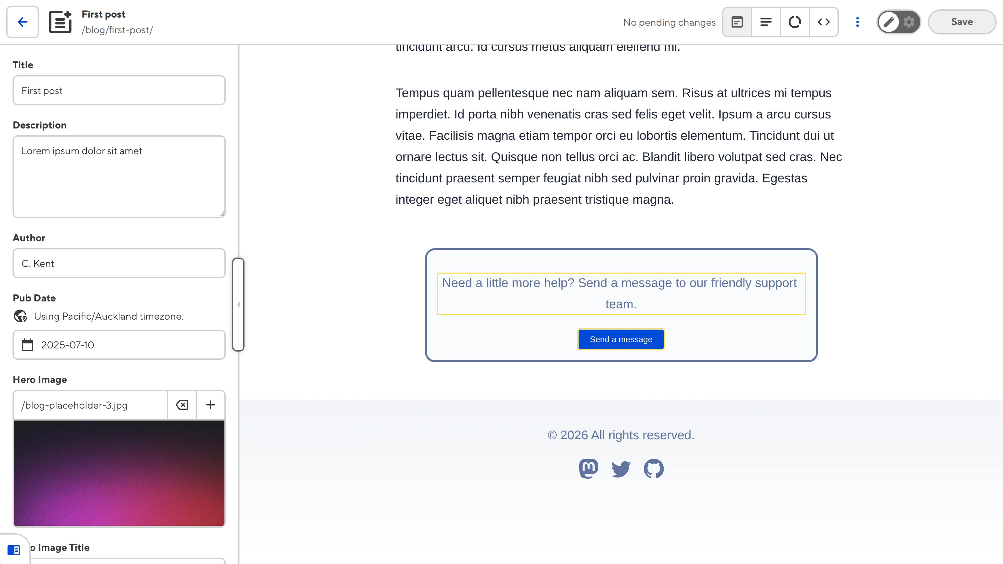
Component Editable Regions are one type of Editable Region you can add to your layout and HTML-like files to enable visual editing. Component Editable Regions allow you to re-render your components in the Visual Editor when you edit the values in the data panel or sidebar.
Component Editable Regions are also required to edit Text or Image Editable Regions nested inside a component.
To avoid misconfiguration issues where CloudCannon cannot find the data property you want to edit, always add Editable Regions to values closest to the root of the file first (i.e., work from parent elements towards child elements).
These instructions assume you have configured your build settings, are comfortable editing HTML layouts, either in CloudCannon's Source Editor or your local development environment, and are using Astro or React components.
To configure Component Editable Regions in the Visual Editor:
- Install the CloudCannon Editable Regions NPM package by opening your website project in your local development environment and running the
npm install @cloudcannon/editable-regionscommand in your terminal. - Create a registration file for your components (e.g.,
src/scripts/register-components.js). - Identify the file to which you want to add a Component Editable Region. We recommend any layout file that references a component and outputs to an HTML page at build time.
- Open the file in CloudCannon's Source Editor or your local development environment.
- At the top of your layout file, import the component registration file. Optionally, you can import your registration file only if the window is in Editor Mode (i.e., your webpage is open in CloudCannon's Visual Editor).
- Identify the component HTML element and add the HTML attribute
data-editable="component". If no DOM element is available, you can wrap the templating in the<editable-component>web component. - Add the
data-prop=""HTML attribute to the same DOM element, or to the<editable-component>web component. The value ofdata-propshould be the path the to data property you want to edit. - Add the
data-component=""HTML attribute to the same DOM element, or to the<editable-component>web component. The value ofdata-componentshould be the name of the component in your registration script file. - Optional. If you also want to edit the text or image contents of your component in the Visual Editor, add other types of Editable Regions to the component layout file.
- Save the change to your Site. CloudCannon will automatically rebuild your Site.
When you open the file in the Visual Editor, CloudCannon will show a yellow Editable Regions box around the component in the Visual Editor. If you added Text or Image Editable Regions to your component file, yellow Editable Regions boxes will also appear around the content.

When you click into the Component Editable Region, CloudCannon will open a data panel with inputs for all structured data keys in the component.
Examples#
Here is an example of files required for a Component Editable Region:
import { registerAstroComponent } from '@cloudcannon/editable-regions/astro';
import CTA from '../components/CTA.astro';

// Register your components
registerAstroComponent('cta', CTA);---
title: 'First post'
author: 'C. Kent'
heroImage: '../../assets/blog-banner.jpg'
heroImageTitle: 'Blog gradient'
heroImageAlt: 'An eye-catching color gradient banner.'
cta:
description: "Need a little more help? Send a message to our friendly support team."
link: "https://www.cloudcannon.com/support/"
buttonText: "Send a message"
buttonColor: "#034AD8"
---
Lorem ipsum dolor sit amet, consectetur adipiscing elit, sed do eiusmod tempor incididunt ut labore et dolore magna aliqua. Vitae ultricies leo integer malesuada nunc vel risus commodo viverra.---
import CTA from '../components/CTA.astro';
---
<html lang="en">
<body>
<main>
<article>
<!-- Blog HTML here -->
</article>
<CTA {...Astro.props.cta} />
</main>
</body>
</html>The <CTA> component uses structured data in the front matter of the files in the Blog collection.
---
const { description, link, buttonText, buttonColor } = Astro.props;
---

<p data-editable="text" data-prop="description">{description}</p>
<a href={link}>
    <button data-editable="text" data-prop="buttonText" style={`background-color: ${buttonColor}`}>{buttonText}</button>
</a>This <p> element contains data-editable="text" and data-prop="description" to define a Text Editable Region.
This <button> element contains data-editable="text" and data-prop="buttonText" to define a Text Editable Region.
Misconfigured Component Editable Regions#
If you accidentally misconfigure your Editable Regions, CloudCannon will display a red warning box in the Visual Editor.
Component Editable Regions are misconfigured if:
- You did not define the
data-propordata-componentHTML attributes. - The Editable Region has an invalid data type (e.g., your Text region has a number or object, instead of a string).
- You reference a component that does not exist, or has not been registered.
- Component rendering errors
- Invalid component return values