A Select or Multiselect input lets your team members select a value (or values) for data from a predefined list of options. Select inputs allow a single value, whereas Multiselect inputs allow multiple values.
There are four types of Select input:
- Select
- Multiselect
- Choice
- Multichoice
For each input, you can configure whether users can create their own values, if inputs can be empty, the appearance of input values, a list of options for data values, add ID keys to each value option, and how CloudCannon handles empty values. You can also use the general configuration options available for all inputs.
You must configure how the value options in your Select or Multiselect input are populated for this input to function. There are three ways to populate the list of options for a Select or Multiselect input:
- Fixed data sets
- Collection items
- Data files
Select#
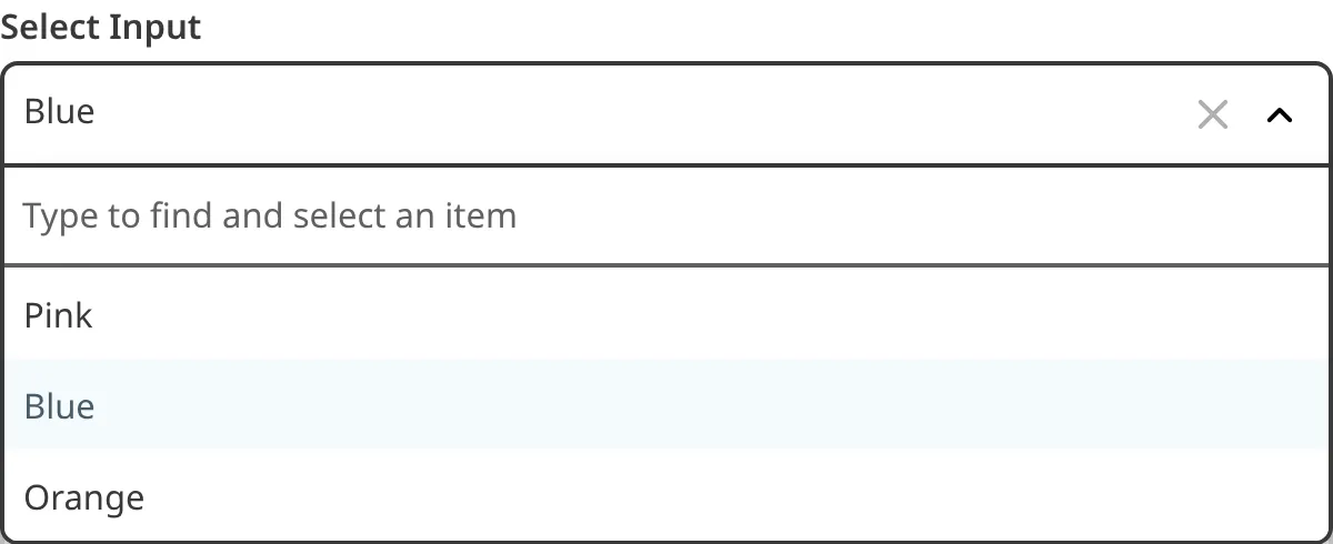
The Select input provides an editing interface for data with multiple predefined options. Only one value is allowed at a time. In the Data Editor, predefined options appear in a dropdown menu.
This input has the same function as a Choice input but a different appearance.
You can configure a Select input using the type
key with the value select
. Define the type
key under your input key name within _inputs
. For more information, please read our documentation on configuring your inputs.
All inputs are defined under the _inputs
key, regardless of where they are in the configuration cascade.
This Select input is called blog_author
.
The value of the type
key determines the input type. This is a select
input.
All inputs are defined under the _inputs
key, regardless of where they are in the configuration cascade.
This Select input is called blog_author
.
The value of the type
key determines the input type. This is a select
input.
Once configured, the Select input will appear in the Data Editor or sidebar of the Visual or Content Editor when you add it to a data file or the front matter of a markup file.
Multiselect#
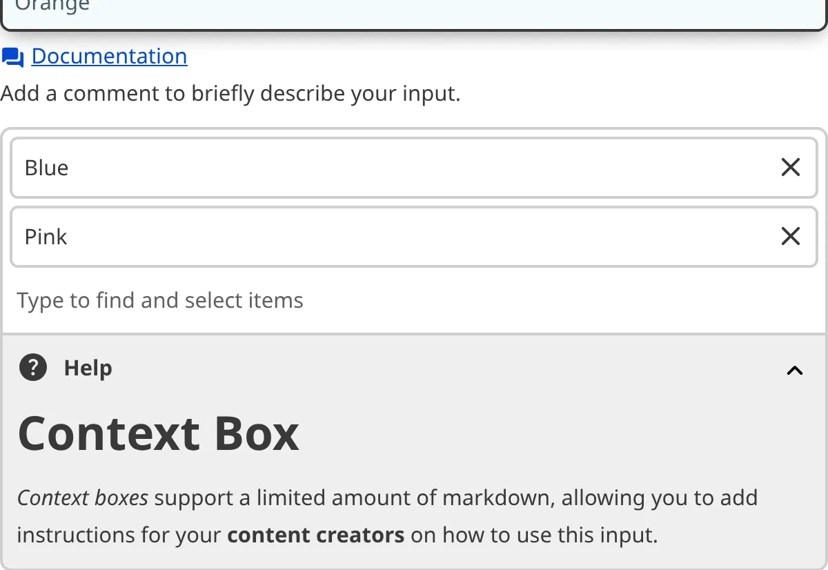
The Multiselect input provides an editing interface for data with multiple predefined options. Several values are allowed at a time. In the Data Editor, predefined options appear in a dropdown menu.
This input has the same function as a Multichoice input but a different appearance.
You can configure a Multiselect input using the type
key with the value multiselect
. Define the type
key under your input key name within _inputs
. For more information, please read our documentation on configuring your inputs.
All inputs are defined under the _inputs
key, regardless of where they are in the configuration cascade.
This Multiselect input is called blog_tags
.
The value of the type
key determines the input type. This is a multiselect
input.
All inputs are defined under the _inputs
key, regardless of where they are in the configuration cascade.
This Multiselect input is called blog_tags
.
The value of the type
key determines the input type. This is a multiselect
input.
Once configured, the Multiselect input will appear in the Data Editor or sidebar of the Visual or Content Editor when you add it to a data file or the front matter of a markup file.
Choice#
The Choice input provides an editing interface for data with multiple predefined options. Only one value is allowed at a time. In the Data Editor, predefined options appear as buttons.
This input has the same function as a Select input but a different appearance.
You can configure a Choice input using the type
key with the value choice
. Define the type
key under your input key name within _inputs
. For more information, please read our documentation on configuring your inputs.
All inputs are defined under the _inputs
key, regardless of where they are in the configuration cascade.
This Choice input is called priority
.
The value of the type
key determines the input type. This is a choice
input.
All inputs are defined under the _inputs
key, regardless of where they are in the configuration cascade.
This Choice input is called priority
.
The value of the type
key determines the input type. This is a choice
input.
Once configured, the Choice input will appear in the Data Editor or sidebar of the Visual or Content Editor when you add it to a data file or the front matter of a markup file.
Multichoice#
The Multichoice input provides an editing interface for data with multiple predefined options. Several values are allowed at a time. In the Data Editor, predefined options appear as buttons.
This input has the same function as a Multiselect input but a different appearance.
You can configure a Multichoice input using the type
key with the value multichoice
. Define the type
key under your input key name within _inputs
. For more information, please read our documentation on configuring your inputs.
All inputs are defined under the _inputs
key, regardless of where they are in the configuration cascade.
This Multichoice input is called theme_color
.
The value of the type
key determines the input type. This is a multichoice
input.
All inputs are defined under the _inputs
key, regardless of where they are in the configuration cascade.
This Multichoice input is called theme_color
.
The value of the type
key determines the input type. This is a multichoice
input.
Once configured, the Multichoice input will appear in the Data Editor or sidebar of the Visual or Content Editor when you add it to a data file or the front matter of a markup file.
Populating the value options#
Without a list of options for the input value, Select and Multiselect inputs become misconfigured.
You can configure a fixed data set or reference a Collection or data file to populate the list of value options.
Fixed data sets#
A fixed data set is an array of predefined value options for your Select or Multiselect input. Fixed data sets are best suited to inputs with values that do not change often.
There are two ways to define a fixed data set: within the input configuration using the options.values
key or anywhere in the configuration cascade using the _select_data
key.
To define the fixed data set within your input configuration, add your array of value options within the values
key in the input options
.
This Multichoice input is called pets
.
You can configure a fixed data set directly inside your input under the options.values
key. This fixed data set contains the options "Dog", "Cat", and "Rabbit".
This Multichoice input is called pets
.
You can configure a fixed data set directly inside your input under the options.values
key. This fixed data set contains the options "Dog", "Cat", and "Rabbit".
To define your fixed data set elsewhere in the configuration cascade, create a nested key and array of value options within _select_data
.
You can configure a fixed data set anywhere in the configuration cascade using the _select_data
key.
The fixed data set called animals
contains the options "Dog", "Cat", and "Rabbit".
You can configure a fixed data set anywhere in the configuration cascade using the _select_data
key.
The fixed data set called animals
contains the options "Dog", "Cat", and "Rabbit".
Using the values
key in the input options
, you can reference a fixed data set defined elsewhere in the configuration cascade. Use the value _select_data.key_name
, replacing key_name
with the key name of your data set.
This Multichoice input is called pets
.
You can reference a fixed data set configured elsewhere in the configuration cascade using the options.values
key. This input references a fixed data set called animals
.
This Multichoice input is called pets
.
You can reference a fixed data set configured elsewhere in the configuration cascade using the options.values
key. This input references a fixed data set called animals
.
Collections#
A Collection is a single folder of files with a similar format. You can find your Collections in the Site Navigation sidebar. Using a Collection to populate your value options is useful when you want to reference pages or other content files created by team members (e.g., blogs, staff pages, or products).
You can reference a Collection for your Select or Multiselect input using the values
key in the input options
. Use the value collections.key_name
, replacing key_name
with the key name of your Collections.
This Multiselect input is called product_carousel
.
This input references a Collection called products
.
This Multiselect input is called product_carousel
.
This input references a Collection called products
.
You must have configured your Collections for this configuration to work.
Data files#
You can populate your input using a dedicated data file, which you can open and edit this file using the CloudCannon file browser. Using a data file to populate your value options is useful when you want your team members to be able to edit the available options.
Your Site may encounter issues if a team member removes an option from your data file that is in use by an input.
Data files must contain arrays of strings or objects. The Select or Multiselect input will use the strings if the data file contains an array, and the key names if it contains objects.
You can reference a data file for your Select or Multiselect input using the values
key in the input options
. Use the value data.key_name
, replacing key_name
with the key name of your data file.
This Select input is called block_theme_color
.
This input references a data file called theme_colors
.
This Select input is called block_theme_color
.
This input references a data file called theme_colors
.
You must have defined your Data for this configuration to work.
Options#
You can configure Select and Multiselect inputs using the options
key under your input key, inside of _inputs
.
Select and Multiselect inputs have the following options available:
This key determines whether you are allowed to enter a new text value that does not appear in the data set. CloudCannon does not add new text values to the data set. Defaults to false
.
This key toggles the presence of an empty option alongside the options listed under values
. Defaults to true
. When false
, CloudCannon will use the first value in the data set by default.
This key has no effect on Multiselect inputs.
This key determines how CloudCannon handles an empty value. This key does not apply to existing empty values.
Value must be one of the following:
string
- an empty value for this input will be stored as "".array
- an empty value for this input will be stored as[]
.null
- an empty value for this input will be stored as a null value (default). This does not apply to TOML files.
Available for Multiselect and Multichoice inputs.
This key enables you to define the appearance of input values in the Data Editor or sidebar of the Visual or Content Editor. The following nested keys are available:
text
icon
(Choice/Multichoice only)image
(Choice/Multichoice only)
Defaults to:
For more information about previews, please read our documentation on configuring card previews.
This key determines the title text displayed for a value option. This key has no default, and has no effect unless the value option is an Object.
If set to false
, no text is displayed.
This key determines the icon displayed for a value option. The value must match a name from the Material Icons list.
If set to false
, no icon is displayed.
If image is defined, the image replace icon when loaded successfully.
Available for Choice and Multichoice inputs.
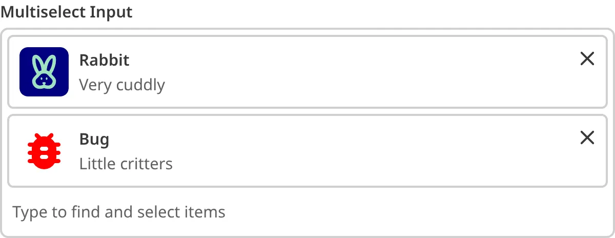
This key determines the image displayed for a value option. This key has no default and, if the value option is an Object, falls back to thumbnail_image
, thumbnail_image_path
, image
, and image_path
in that order. If no image is found, icon
is displayed instead.
If set to false
, no image is displayed.
Available for Choice and Multichoice inputs.
This key determines the available values for your input. If this key contains an object or array, CloudCannon will use the listed values. If this key contains a string, CloudCannon will fetch the values from the data set referenced.
Defaults to fetching values from a data set following the naming convention (e.g. colors
or my_colors
for data set colors
).
This key defines which key CloudCannon should use as the Select/Multiselect input value when a value option is an Object with multiple nested keys.
Defaults to ['id', 'uuid', 'path', 'title', 'name']
. Has no effect unless values
is an array of objects.
If set as an array, keys are tried in order, until a non-empty value is found. If no keys are set for an available value, that value is not included in the input options.
If set as a string, this key is used directly. Value options are excluded if they don't have a value for this key.
Sites created before 25 November 2021 have a different default for saving collection items in order to keep existing sites working. Create a new site, or use the Legacy Collections Value Key flag to update this for your site.
Unconfigured Select and Multiselect inputs#
In some cases, CloudCannon can still detect an Object input even if you have not configured it.
CloudCannon will interpret any key as a Select input if the key name ends in the singular form of a fixed data set you have defined under _select_data
(e.g., author
or blog_author
for the fixed data set authors
).
This behavior is convenient if you have simple inputs or do not want to configure inputs.
We recommend configuring your inputs for greater control over their functionality and appearance.