You can alter how your Structures appear by configuring the preview for each structure. When you have many structures under the same key, configuring the appearance of these structures is a good way to differentiate between them and create an intuitive experience for your team members.
CloudCannon uses a data card to represent each structure in objects and arrays. These cards are configurable UI elements that give you a preview of that data. Cards representing your structures appear in the dropdown menu, pop-up modal, and in the Data Editor or sidebar of the Visual or Content Editor.
You can configure how card previews look using the preview key. For each structure, you can configure the values for the text, subtext, image, and icon within the preview key. The text, subtext, image, and icon keys can contain a string, a key, or an array of strings or keys.
text— Add a title to your structure preview.subtext— Add a subtitle to your structure preview underneath your title. (Iftextis not configured, then the string forsubtextwill appear in the title.)image— Add an image to your structure preview.icon— Add an icon from Google’s Material Icons list to your structure preview. The name of your icon must match the Material Icon name.
Icons and images appear in the same place on your preview. If your image fails to load or has no value, it will fall back to an icon (if one is configured).
Let’s go over an example of how you would configure the preview of a structure.
We want to create an array of staff members for our staff web page. The staff array can contain items that use either an “Employee” or “Manager” template. We’ll create these item templates using two structures. The Employee structure will have fields for a name, job description, and profile picture. The Manager structure will have the same fields but also include a URL field for a link to their calendar. We will configure these fields under the value key in each structure.
We can configure how these structures look under the preview key. Let’s implement the following:
- Make the staff member’s name, job description, and profile picture appear on each card in the array.
- When no name, job description, or profile picture is selected, the fields fall back to a string or icon.
Here is our structure configuration:
_inputs:
  staff:
    type: array
  profile_picture:
    type: image
  job_description:
    type: textarea
_structures:
  staff:
    style: modal
    values:
      - value:
          _type: Employee
          name:
          job_description:
          profile_picture:
        preview:
          text:
            - key: name
            - Employee
          subtext:
            - key: job_description
            - Description of position
          image:
            - key: profile_picture
          icon: support_agent
      - value:
          _type: Manager
          name:
          job_description:
          profile_picture:
          url:
        preview:
          text:
            - key: name
            - Manager
          subtext:
            - key: job_description
            - Description of position
          image:
            - key: profile_picture
          icon: face
{
"_inputs": {
"staff": {
"type": "array"
},
"profile_picture": {
"type": "image"
},
"job_description": {
"type": "textarea"
}
},
"_structures": {
"staff": {
"style": "modal",
"values": [
{
"value": {
"_type": "Employee",
"name": null,
"job_description": null,
"profile_picture": null
},
"preview": {
"text": [
{
"key": "name"
},
"Employee"
],
"subtext": [
{
"key": "job_description"
},
"Description of position"
],
"image": [
{
"key": "profile_picture"
}
],
"icon": "support_agent"
}
},
{
"value": {
"_type": "Manager",
"name": null,
"job_description": null,
"profile_picture": null,
"url": null
},
"preview": {
"text": [
{
"key": "name"
},
"Manager"
],
"subtext": [
{
"key": "job_description"
},
"Description of position"
],
"image": [
{
"key": "profile_picture"
}
],
"icon": "face"
}
}
]
}
}
}The _inputs key contains all the inputs defined at a given level of the configuration cascade.
The _structures key contains all the structures defined at a given level of the configuration cascade.
The key name of your structure. In this code, we have called our structure staff.
This is the first structure in the group named staff. This structure has value and preview defined. Under value we have added fields for name, job_description, and profile_picture. For more information on _type, read our reference documentation on structures.
Under the preview key in the first structure, “Employee”, we have defined text, subtext, image, and icon. In some cases, we have added an array of values for these keys to provide fallback options.
This is the second structure in the group named staff. This structure has value and preview defined. Under value we have added fields for name, job_description, profile_picture, and url.
Under the preview key in the second structure, “Manager”, we have defined text, subtext, image, and icon. In some cases, we have added an array of values for these keys to provide fallback options.
In our configuration file, the objects preview.text and preview.subtext contain arrays. These arrays initially set the object value to the keys name or job_description but also have a fallback string if no values are found. For the object preview.text, the fallback string is either “Employee” or “Manager”, depending on the structure. For the object preview.subtext, the fallback string is “Description of position”.
In both structures, we have configured the object preview.image to equal the value of the profile_picture key. If no value is found, we have configured the object preview.icon to equal an icon from Google’s Material Icons list. The icon is face or support_agent, depending on the structure.
At the top of this configuration file, we have also defined a few inputs (i.e., staff, profile_picture, and job_description). For more information on this, read our documentation on configuring your Inputs.
Here is the front matter of the file containing our array:
staff: []Let’s populate the array to see the previews in action.
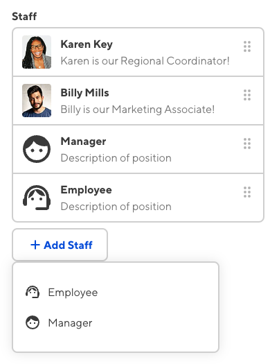
We have added a Manager “Karen Key” and an Employee “Billy Mills”. We entered the names of each staff member in the name field, a short sentence about their position in the job_description field, and the image path in the profile_picture field.
We have also added two blank objects to the array, one using the Manager option and one using the Employee option.
Here is how the array looks in the sidebar of the Content Editor.

Our blank array items look a little different. The text and subtext for each card match the fallback strings we configured for these options. Also, with no image path selected, the cards have fallen back to the icons we configured.
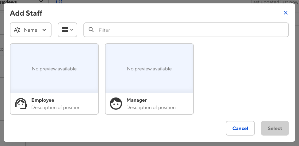
These fallback values also appear in the dropdown menu or pop-up modal when selecting an option for new array items. In the image above, the dropdown shows the value of preview.icon and preview.text. In the image below, we see the value of preview.icon, preview.text, and preview.subtext, when the array style is switched to a pop-up modal.

For more information about data cards in CloudCannon, read our documentation on configuring your card previews.