Sparking joy: CloudCannon UI improvements

In November 2020, we debuted aesthetic updates to the CloudCannon brand for the first time. The most noticeable impact hit our marketing site, with the app taking a more reserved approach. These brand updates included a new brand font (TT Norms), color palette, illustration style, and layout patterns. Our choices for both the font and colors were supported by internal accessibility research and the resources offered by The A11y Project, and took big strides towards making our app and website even more accessible and user-friendly.
After spending the majority of 2021 adding support for new static site generators across the Jamstack spectrum, our app team saved some development energy to open the covers and see how the pixels were looking. We expected to find a little dust and tangled wires — not because we were doing bad things, but rather because we knew we accumulated a bit of design debt over the last few years.
The UI updates from our review will be rolled out next week. There’s (hopefully) nothing scary ahead, but going into this project we had a few goals:
Our goals Direct link to this section
- To align our brand across our Marketing, Documentation sites, and app.
- To make UI improvements to our components in the Visual Editor and Data Editor, setting them up to look as world-class as they function.
- To identify and scope UX improvements in our components.
- To build a sticker sheet for all of our components. (This last one is an internal feature for our team, and will make it that much easier for us to review and maintain everything.)
What you said Direct link to this section
Our ongoing research puts us in regular touch with you, our lovely users. From our conversations, we’ve learned a few things about both our brand and our app. Here's what you had to say:
- You generally enjoy the direction we’re heading in and are excited by adding more of our clean, friendly brand into the app.
- Our app can be slightly too technical in places. It’s important to you that we offer a good balance between technical capabilities and intuitive, friendly editing.
- Most importantly, we heard that you wanted a heads-up before we made our next batch of updates. So, here we go!
Colors, type, and icons Direct link to this section
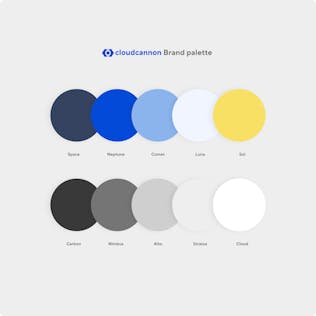
We opened our project with a review of our colors and font styles. We found 52 varieties of color and 26 sizes of type in the codebase. Many of these were holdovers from our previous brand styles, with a couple having absolutely no reason or rhyme for existing.
The majority of the colors needed consolidation, as in many cases we had different values for the same color. For example, we have consolidated nine of the values into our black, named Carbon. We now have 13 brand colors in the app, including three for success, warnings, and errors.
During the initial brand project last year, our designer Haowei Yu conducted an extensive accessibility study, fashioned an A11y-friendly color palette, and named our colors. We’ve maintained her palette, with only one slight tweak to our Nimbus gray, from #707070 to #757575.
We also switched our Material icons from Filled to the Rounded set. Shout out to Sil for pulling my attention to it — I appreciate it!
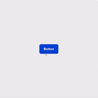
A new eight-pixel radius world Direct link to this section
The most noticeable change comes to our border-radius and is coming across the board. We’re increasing the radius from two to eight pixels. Regulars to our marketing site and blog will be familiar with our use of rounded corners, and I am personally very excited to pull them into our app. Our research shows that this will help our app feel friendlier and more familiar, especially to the editors and clients who mostly use our CMS.
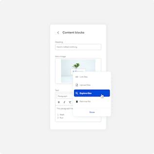
The move to eight-pixel borders gives us the opportunity to review and tweak all of our inputs (and build the component sheet). You can expect to see UI updates to every input, along with some UX improvements to the image selector. We’ve also made working with your content blocks much easier — rather than clicking to move them up or down a single place in the list, you can now simply drag to reorder them.
Better clicks Direct link to this section
We were aware of a little quirk between our primary and secondary buttons: on hover, their colors would mirror each other. So just before you would click on a primary button, it would change to look exactly like a secondary button, and vice versa. This was a small holdover from developing our app to allow you to set your own brand color. No need to worry — we’ve fixed that behavior, while still maintaining your ability to set a custom brand color.
Further upgrades include changing the font to be bolded for better contrast and switching from ‘All caps’ to ‘Title case’ for a friendlier label. Oh, and while we were in there, we included the aforementioned eight-pixel border-radius, and added a highly visible focus state and a subtle ripple effect on click.
Navigation and menus Direct link to this section
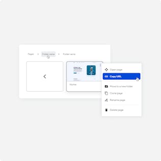
In August of this year, we improved the orientation on the organization-level menu by opening up each page to show their labels and adding helpful empty states where relevant. This improvement is particularly helpful for new users and those who infrequently make edits to their sites.
For our UI project, we've rolled out interactive upgrades to the site navigation, file browser, context menus, modals, and dropdowns. Across these, we defined a strong shadow, added a subtle border, and positioned them nicely in relation to their click. In our menus, we added relevant icons to support the action in each option. Over in our file and page browsers, we’ve iterated on the style of our breadcrumbs and redesigned the look of our return button. Both of these changes make it easier and faster to navigate your files.
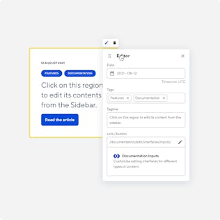
Free the sidebar (teaser) Direct link to this section
A major attraction of using our CMS is “editing on the page” in the Visual Editor. Currently you can edit inline elements such as text, links and images. Editing blocks of components on the page requires using an editor link to the Sidebar or the Data Editor. On a long page, these require a bit of focus to keep up with. Alternatively, switching to the Data Editor means you lose that sense of editing on the page.
Coming before the end of the year, we’ll give you the option to use a popout panel on content blocks. In the Visual Editor, you will be able to set up a floating panel with all your inputs right there on the page. You can even grab the drag handle and move the panel around.
We’re really hoping that this improvement will help you design your own editing experience. It’s an exciting extension of our current editing. There will be more on-page functionality coming, so keep an eye out for our announcement posts!
2021 has been the first full year our team has had dedicated design support and research. As a team, we're leaning on Human-Centered Design values, and we've never been more focused on user success. I see these improvements as a healthy stride forward on our journey: we’re aligning our brand, and most importantly we're living our values.
We know there will be more improvements to make as we grow and add new features, and I want to personally invite you to join us and get in touch.
Launch your website today
Give your content team full autonomy on your developer-approved tech stack with CloudCannon.