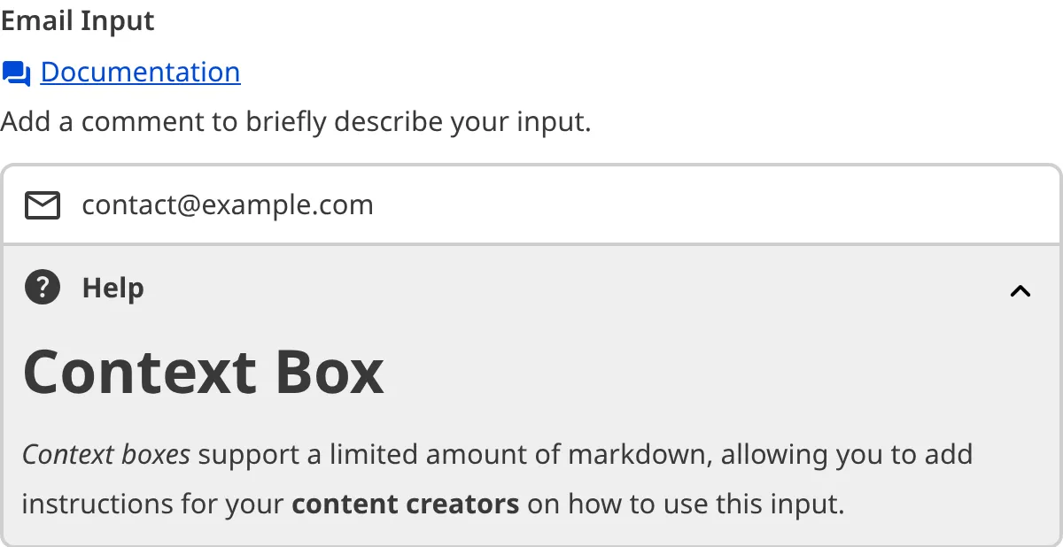
An input is an editing interface for structured data in your data files or the front matter of markup files. Inputs appear in the Data Editor and the sidebar or data panels in the Content Editor and Visual Editor.
- Structured data — Data organized in a clear, predefined, and consistent format. This can be quantitative (e.g., numbers) or qualitative (e.g., text, links, or file paths).
- Front matter — Structured data that precedes the main content in a markup file (e.g., a Markdown or MDX file). This data contains information about the file that should not be in the content body, such as the file title, author, or SEO information.
An input could be a text field for the description of your file, a date field for the day a blog was published, a select field with predefined tags for your content, or more.

Inputs allow your team to edit structured data in their files without using the Source Editor. By configuring each input, you can control its appearance and functionality, creating a custom editing interface for the variables your team needs.
You can configure inputs at any level of the configuration cascade, allowing you to define a default configuration for use anywhere in the Site and then override that default for specific Collections or files. In this way, you can control the scope and priority for a given input configuration.
For more information, please read our documentation on the configuration cascade and configuring your inputs.
Basic input configuration#
Every input has some basic configuration: the label, comment, context, and type. The label, comment, and context allow you to describe the intended purpose of the input, while the type determines its functionality.
CloudCannon supports twelve types of inputs.
- Boolean — Define a true or false value using a checkbox or a switch.
- Code — Add a code editor.
- Color — Add a color using a color picker with spectrum and transparency controls.
- Date and Time — Define a date and/or time.
- File — Upload a file, such as an image or a document, and store the file path.
- Number — Add a number using a text box or a range slider.
- Object — Group inputs under a single Object.
- Array — Create a list of inputs or input groups.
- Select and Multiselect — Select one or more options from a predefined list.
- Text — Write plain text content.
- Rich Text — Write and format markup content in HTML or Markdown.
- URL — Add a relative or absolute URL.
Each type of input has additional configuration options. For more information, please read our documentation on each input type.
Input validation#
For some inputs, you may want to ensure that content creators have entered a value before they save their changes, or that a value meets a list of prerequisite criteria. By configuring input validation, CloudCannon will prevent you from saving an input with an invalid value.
In some cases, the CloudCannon UI will change to prevent you from adding invalid input values. For example, CloudCannon will disable the Add button on an Array input to prevent you from exceeding the maximum allowed number of items, or prevent you from selecting a date outside of the allowed range in a Datetime input.
For more information on what validation methods are available, please read our documentation on each input type.
Default behavior for unconfigured inputs#
If you have not configured your inputs, CloudCannon will attempt to determine the correct editing interface for your data using the input value and key name.
The value of an unconfigured input can help CloudCannon determine its type. For example, CloudCannon will interpret a key with a true or false value as a Boolean input and a string value as a Text input. CloudCannon can use this method to determine Boolean, Number, Object, Array, and Text inputs.
Most input types also have a naming convention that allows CloudCannon to determine the input type by the key name. For example, CloudCannon will interpret any key name ending in _color or _hex as a Color input and any key name ending in _path or _image as a File input. Each input type has multiple naming conventions. CloudCannon can use this method to determine Code, Color, Date and Time, File, Number, Select and Multiselect, Text, Rich Text, and URL inputs.
Using these methods, you can add inputs to your files without the need for configuration. This behavior is convenient if you have simple inputs or do not want to configure inputs. It is also beneficial for new websites on CloudCannon where you have yet to create any CloudCannon-specific configuration.
The default input behavior may not be suitable for you if:
- Your value or key name is not specific enough for CloudCannon to determine your desired input type.
- You want to customize the user experience for your input.
We recommend configuring your inputs to overcome these limitations and for greater control over their functionality and appearance.