Why information architecture matters for your website

Information architecture (IA) may be seen as a dry or technical aspect of web design, but I think it’s more than that — it’s a framework that can nurture creativity and growth. Just like pruning a tree to guide its future shape, IA helps set boundaries that allow web content teams’ creativity to flourish — all within carefully defined (and designed) limits.
I’ve been designing for the web for 8 years now, and while a lot has changed over that time, I still find that IA is one of the most important processes to get right when our team is working on a new project.
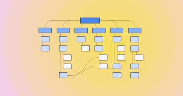
So what is IA, really? Basically, IA in web design refers to the organization, structuring, and labeling of content on a website to make it easily navigable and understandable for users. It's essentially about creating a logical framework that helps users find information and complete tasks efficiently.
It’s important to get it right, too — by understanding both the users and editors of a website, we can help create a logical, intuitive structure that enhances user experience, improves efficiency, and supports both user needs and business goals.
Information architecture for users and editors Direct link to this section
Mapping out a website’s information architecture can — and I think should — be broken down into two key sets of components: one focused on end users, and one focused on content editors.
For example, if you’re designing a site for a university, the needs of students, faculty, and administrators (the most common end users) must be balanced. A navigation system that works well for students might not be ideal for faculty, and vice versa. Therefore, a good IA should be intuitive for all user groups and flexible enough to evolve as the site grows.

We also need to be mindful that a good website is a living document — it will grow, with time; users’ needs will change, and a wide range of content editors will likely work on it. So my assessment of a site’s existing IA, and my recommendations for its future IA, also consider the needs of the web content team. Can we help remove any friction in their day-to-day tasks? Can we establish clear design rules that allow for future growth? Can we maintain a consistent structure while letting them get on with their work?

CloudCannon's flexible component structure, pictured above, make things easier to design for editors. By contrast, navigation editing interfaces can be particularly tricky, as they need to allow editors to modify the site's navigation structure without breaking the overall information architecture. But it’s also a really rewarding task!
My information architecture goals Direct link to this section
Designers aim to create websites that are easy to understand and use. We do this by organizing content in a way that makes sense, and by creating clear navigation. This helps users find what they want and finish tasks quickly. When users can do this they experience less frustration, and can almost enter a flow state where nothing stands in their way. This is an ideal outcome, of course, but it’s always best to aspire for the best case scenario!
IA goals for users Direct link to this section
To make things easier to find, I always try to design good search functions, group similar things together, and use (or recommend) consistent labels. All of this helps users make decisions by showing them information in a clear way. Users can quickly see their options and choose what's best for them. When users have a smooth experience like this, they're happier overall. They're more likely to enjoy using the site and want to come back later.
IA goals for content teams Direct link to this section
But I also like thinking about the people who manage the website, the content editors and developers. They are the ones working within the system that’s growing and changing over time, so it’s important to make it as easy as possible to manage content and keep the site running smoothly. In CloudCannon, for example, we design and set up components that editors can easily update, and make sure the navigation is simple to manage too. This means editors can keep the site consistent as it grows — and trust me, it will grow!
By thinking about editors as well as the users, I can help make sure their website stays strong and flexible. This way, editors can add new content and make changes without affecting how the site works or looks to users. Having a solid structure for growth means less time and money spent on big overhauls or rebuilds as the site changes over time.
IA goals for businesses Direct link to this section
Businesses benefit from good IA too. When users can easily find content and do what they need to do, they stick around longer and visit more often. This increased engagement often leads to more of whatever the business wants — whether that's sales, sign-ups, or something else. By matching how the site is set up with what users need and what the business wants, information architecture becomes a powerful way to reach business goals.
The importance of understanding your audience Direct link to this section
Understanding the personas of your users is critical. Whether you're designing for tech-savvy students who appreciate modern interfaces or for older web users who may prefer a more traditional layout, your IA should cater to their specific needs. This involves conducting market research, analyzing competitors, and even interviewing and shadowing users to get a clearer picture of what they need.
One of the biggest challenges in IA is anticipating how users will interact with the site, which is why I love talking to users and (ideally) watching them actually use their site — it lets me recognize their pain points much more easily, and identify how best to solve them.
Of course, designers often have to balance aesthetics with functionality, ensuring that sites remain user-friendly as they evolve. For instance, a navigation system that works well on a desktop might not translate as effectively to a mobile device. This is where responsive design comes in, allowing the site to adapt seamlessly to different screen sizes.
Resources for information architecture Direct link to this section
Nielsen Norman Group
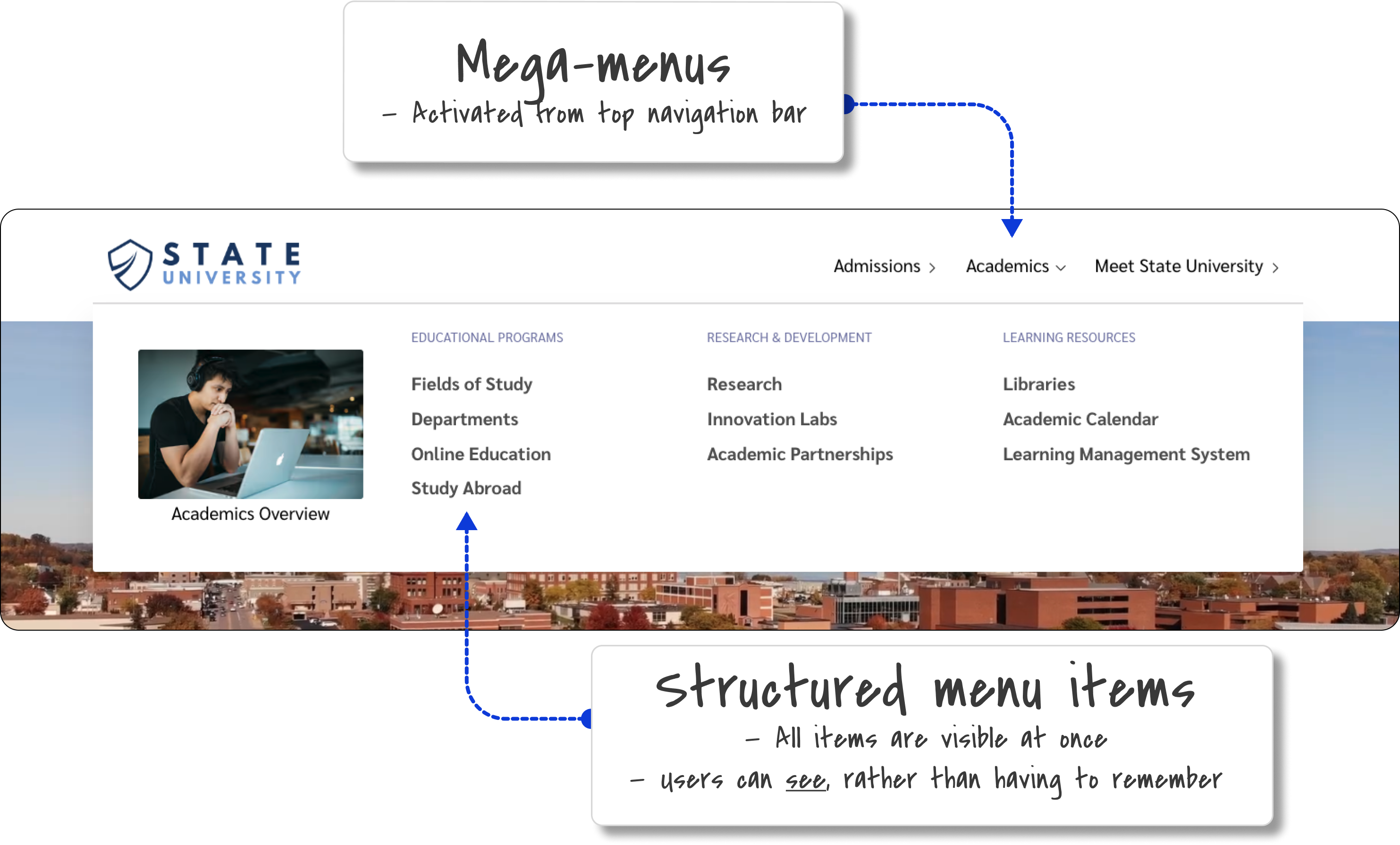
- Mega Menus Work Well for Site Navigation
- Menu-Design Checklist: 17 UX Guidelines
- Taxonomy 101: Definition, Best Practices, and How it Complements Other IA Work
- Information Scent: How Users Decide Where to Go Next
O’Reilly Online Learning
UX Mastery
Systems for creativity and growth Direct link to this section
Overall, information architecture is not just about organizing content; it’s about creating systems that support both creativity and growth.
The idea that constraints foster creativity might seem counterintuitive, but in practice, setting rules within IA can give designers, developers, and users more freedom. By establishing a system with clear guidelines, you create a space where people can explore and innovate without fear of breaking the structure. This approach not only benefits the users but also the editors who manage the content.
By setting creative constraints, considering the needs of both users and editors, and designing for flexibility, you can build a site that not only meets current needs but will also adapt to future changes. In this way, IA is a powerful tool for fostering innovation and ensuring long-term success in UX design, content strategy, web performance, and everything else a client may need!
We're here to help
Interested in an IA assessment? Get in touch with our solutions team to discuss your project.


