Introducing the Astro Component Starter

Building a marketing site usually means stitching things together yourself. You pick a build tool. You pick a component library. You pick a CMS. Then you spend days, sometimes weeks, wiring them together, deciding what editors can change, building the integration layer, and maintaining it as both sides evolve.
The Astro Component Starter cuts that work out. It's a complete, integrated component system — 30+ Astro components, a design token system, visual editing configuration, and built-in documentation — ready to scaffold a marketing site in minutes. Think of it as building your own page builder, except you own every file and there's no platform ceiling.
Join me and Astro co-founder Fred K. Schott as we talk through the Starter, Astro v6, and officially kick off a $4,500 prize pool community challenge:
From scaffold to branded site Direct link to this section
Start with the CLI:
npx create-astro-component-starter my-site-name
cd my-site-name
npm run dev
You immediately have a working site at localhost:4321 with pages, a blog, navigation, and a full component documentation site. Out of the box, the design is intentionally neutral. It's meant to disappear into whatever brand you bring.
Design tokens handle the broad strokes: update CSS variables for colors, fonts, spacing, and the entire site shifts at once. That gets you most of the way. For the rest, every component's CSS is right there in your codebase — not hidden behind an abstraction layer, not locked in a package you can't touch. It's normal CSS in files you own, so branding work is just styling work.
A page builder you control Direct link to this section
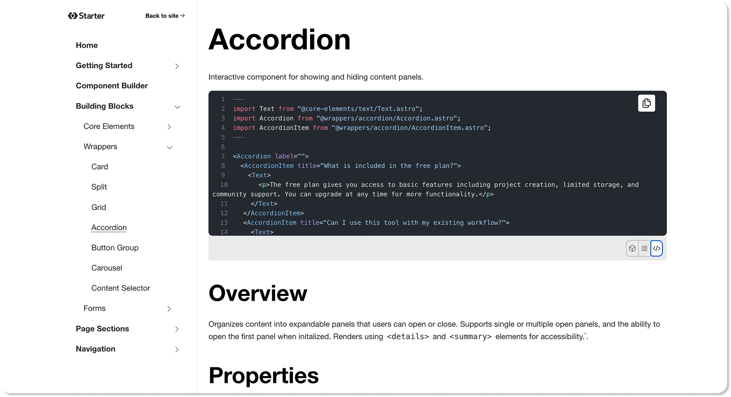
Components are standard Astro component in your src/components/ directory. The building-block components — buttons, headings, images, text blocks, form elements, layout grids — are simple on purpose. They're tuned for performance and accessibility, built on semantic HTML and vanilla CSS. The power is in composition.
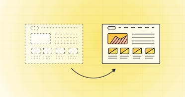
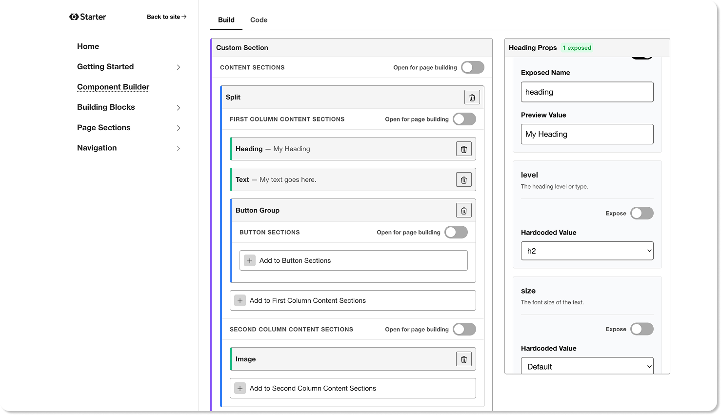
Combine building blocks into page section components: heroes, feature showcases, testimonials, pricing grids, CTAs. Use the built-in component builder to prototype combinations without writing code, or compose them directly in your Astro files. Either way, the result is production-ready and configured for visual editing.
Built for visual editing Direct link to this section
Every component in the starter is pre-configured for CloudCannon's visual editor. That means your editors can click directly on elements on the page — a heading, an image, a call-to-action — and edit them in place, seeing their changes live on the actual site. No switching between a form and a preview. No guessing what the result will look like.
But it goes beyond inline text editing. Editors can add, remove, and reorder entire sections on a page by picking from the components you've built, assembling pages from your component library without touching code. It's a page builder experience, except every component is yours, the output is a high-performance Astro site, and the content lives in your Git repository.
You decide exactly what editors can touch. Lock a layout down to text-only edits, open a section up so editors can add, remove, and reorder blocks, or give them full page building where they can chain together anything in the system. Every component is fully documented: developers can define the boundaries; editors work freely within them.
If you're an agency, this goes further. Take the Component Starter, add the components you use on every project, wire in your layouts, set up your brand tokens — and you've built your own page builder, except you own the code and control the editing experience.
Here's one we prepared earlier Direct link to this section
To see what a finished site looks like, take a look at Jetstream — the first full template built on this foundation. It assembles the starter's building blocks into polished page sections, extends the design tokens with a richer color palette, and introduces new component variants where the design called for them.
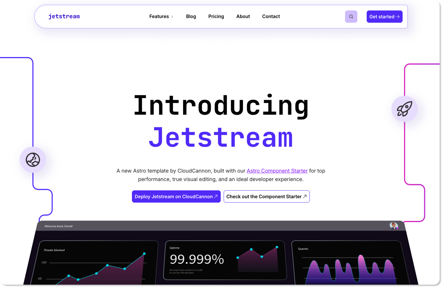
Jetstream also demonstrates the CloudCannon editing experience across all three major editors: component-based visual editing for pages, Markdown with optional visual previews for blog posts, and data editing for structured content like team members. If the Component Starter shows you the pieces, Jetstream shows you the finished puzzle. Read Alysha's full post for details on what's included and how it was built.
Whether you're starting a client site next week or building a reusable foundation for the next ten, the Astro Component Starter gives you something solid to stand on. The hard part — the wiring, the integration, the maintenance — is already done. Clone it, extend it, make it yours.