How you can optimize your Visual Editor for page building


CloudCannon’s seamless visual editing allows you to update your site's content directly on the page. For users who appreciate seeing their content in its final context, as the public will see it, this is a great feature — there’s no switching between a WYSIWYG editor and the pre-published page.
Thinking about the words on the page is very important, of course — try finding a writer or a marketer who doesn’t agree with that! — but there’s something special about being able to actually see what the page feels like as you’re writing. It’s certainly possible to draft excellent copy in a blank text editor, but writing your copy in context — at the correct page width, next to your correctly styled heading, and with your accompanying images — can be an incredibly productive way to work.
To fully leverage CloudCannon’s flexibility, it’s important to ensure that you and your developer have thought through how you’ll work on your website. In this article, I’ll guide you through the steps I follow to optimize my visual editing experience with CloudCannon.
Choosing components for visual editing Direct link to this section
When it comes to actually making your new pages, you and your developer have a huge amount of choice. Developers who are setting their users up for success on CloudCannon will create the necessary components — the building blocks of the page — that enable non-technical editors to build their own pages.
It might help here to think about what a page component actually contains — we can boil that down to two main categories: your content (words, images), and your layout (stylesheets, spacing rules, etc.). While you’ll almost always want the content in your components to be different when you reuse them, the same isn’t necessarily true for your layouts. Let’s dig into why!
Fixed page-building components Direct link to this section
I tend to think of a ‘fixed’ page component as one that doesn’t allow for too much additional styling. A developer of a fixed component would typically offer a small range of styles and layouts (like colors or text alignment), leaving the editor with the primary freedom of changing the content within the component. The decision on how that content is presented has already been made.
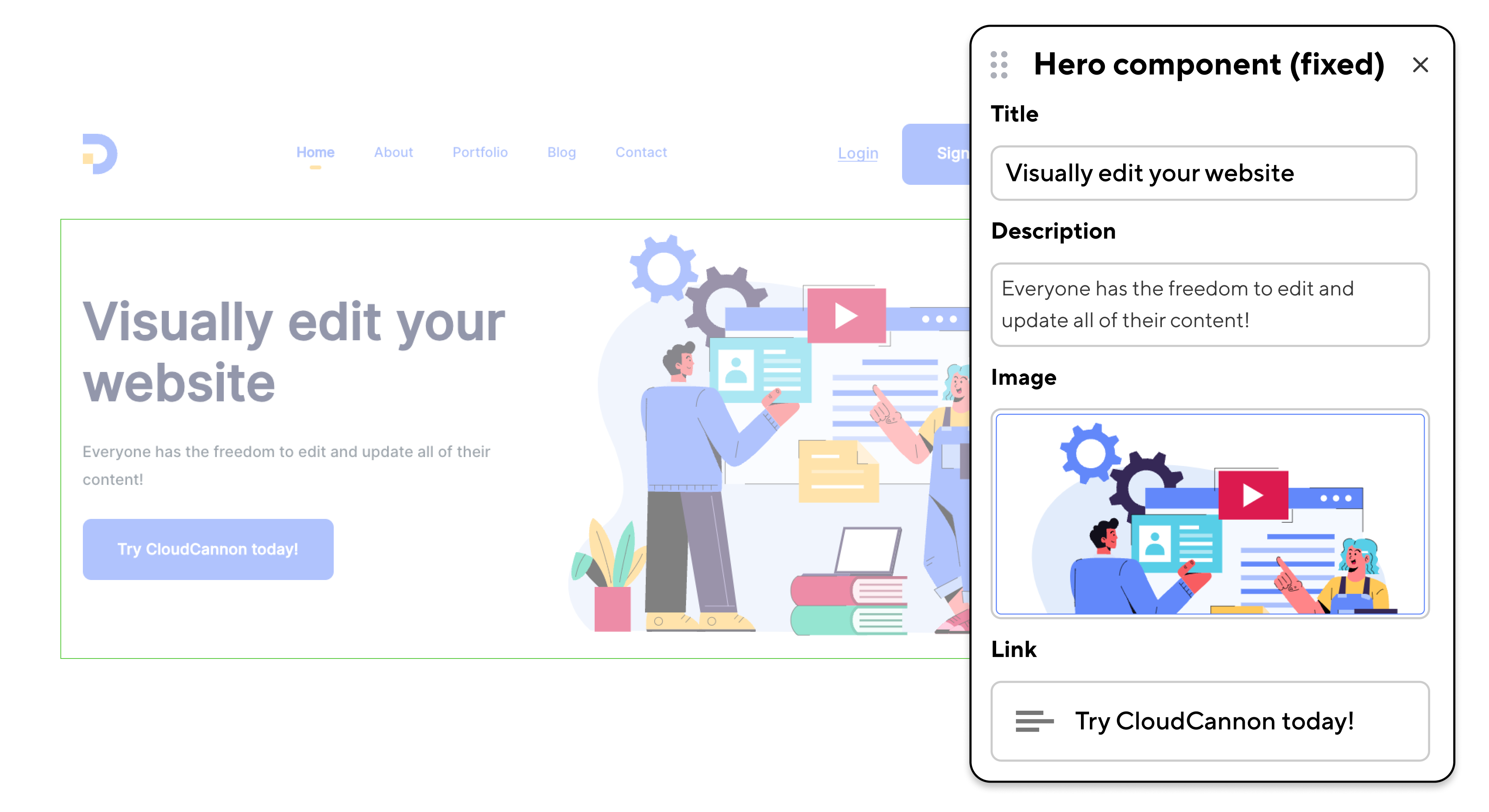
With a fixed component, for example, your developer might determine that color choices can only be made from a predetermined brand palette, or that a certain amount of negative space is present on the page. In certain situations — for example an organization with a very opinionated design language — the fixed approach would be safer, because in theory it would be almost impossible for a page editor to diverge from a brand’s guidelines.
When set up correctly, fixed components can help page editors build content that is as accessible as possible by default — again, this can be an excellent solution for organizations with strict accessibility targets.
In many cases fixed components can be a more productive way to work. Editors can usually publish content more efficiently because any difficult design decisions are already made for them: they can trust that the pages they're building will fit their brand.
Flexible page-building components Direct link to this section
Alternatively, developers can create more ‘flexible’ page components that allow for a lot more freedom on the part of the page editor. I’d call a page component ‘flexible’ if it doesn’t make any assumptions about its layout. By default it might include preset margins and padding rules, or a certain heading size, but editors would be able to jump into the settings and adjust anything they like. A flexible component might include different settings for both content and styles, as below.
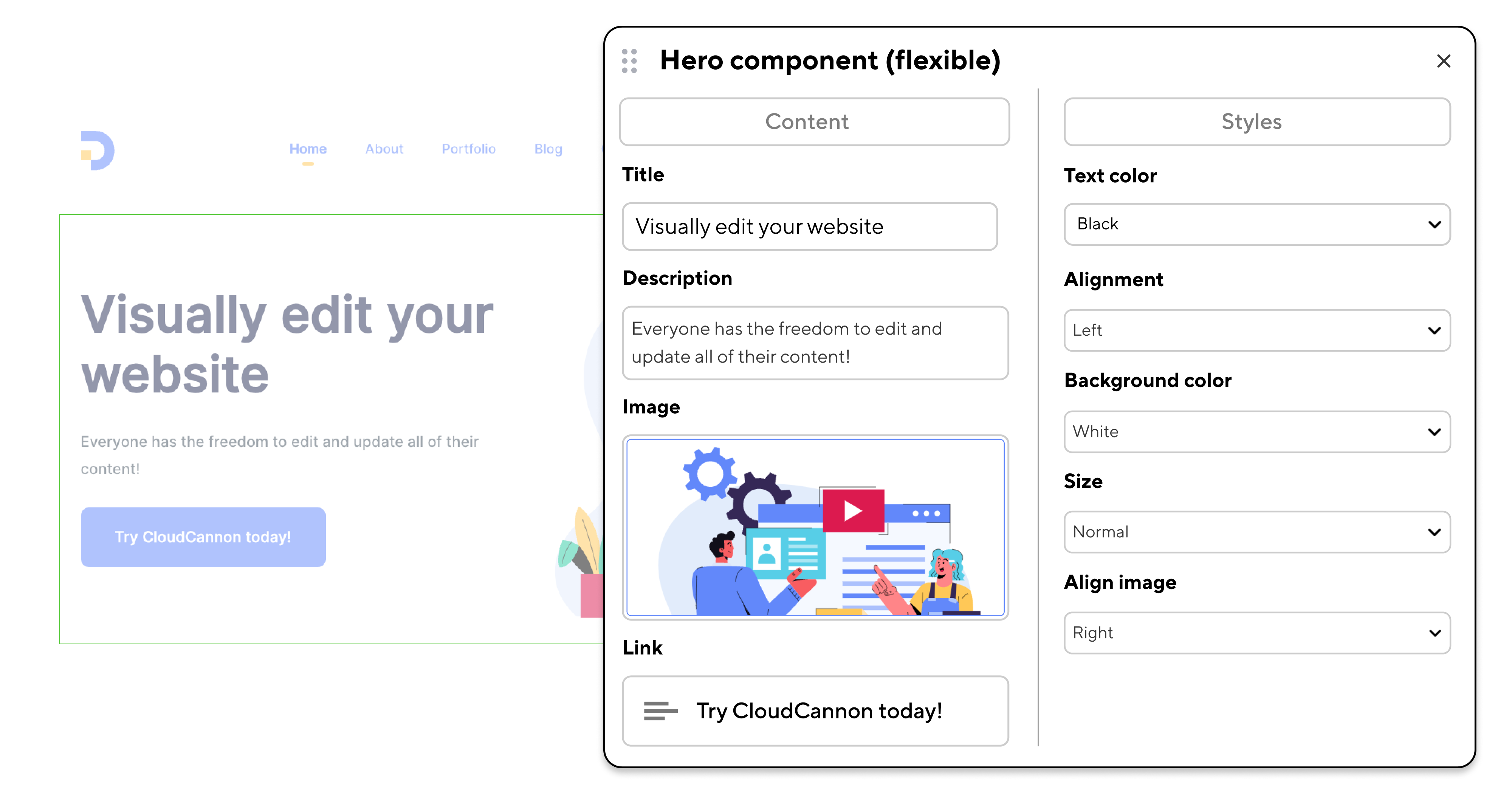
Making your components flexible is an important development decision, and it’s worth considering just how much you want to control before a page is built, and how important your brand’s design language is. (It’s likely that over time, an editor with more options will slowly diverge from a designer’s starting point if not given the constraints that come with fixed components.)
While personally I appreciate having more choices as a content writer and editor, I am definitely not a designer, and I’m also lucky that I work with colleagues with much better color vision than me! Your team’s strengths may well be different; being faced with too many options to choose from can be difficult in its own right, and I can certainly see the appeal of reducing options for more efficient editing.
Creating your own components using containers Direct link to this section
One aspect of the page-building experience on CloudCannon.com that I really enjoy is using a ‘Container’ component to hold other, simpler components.
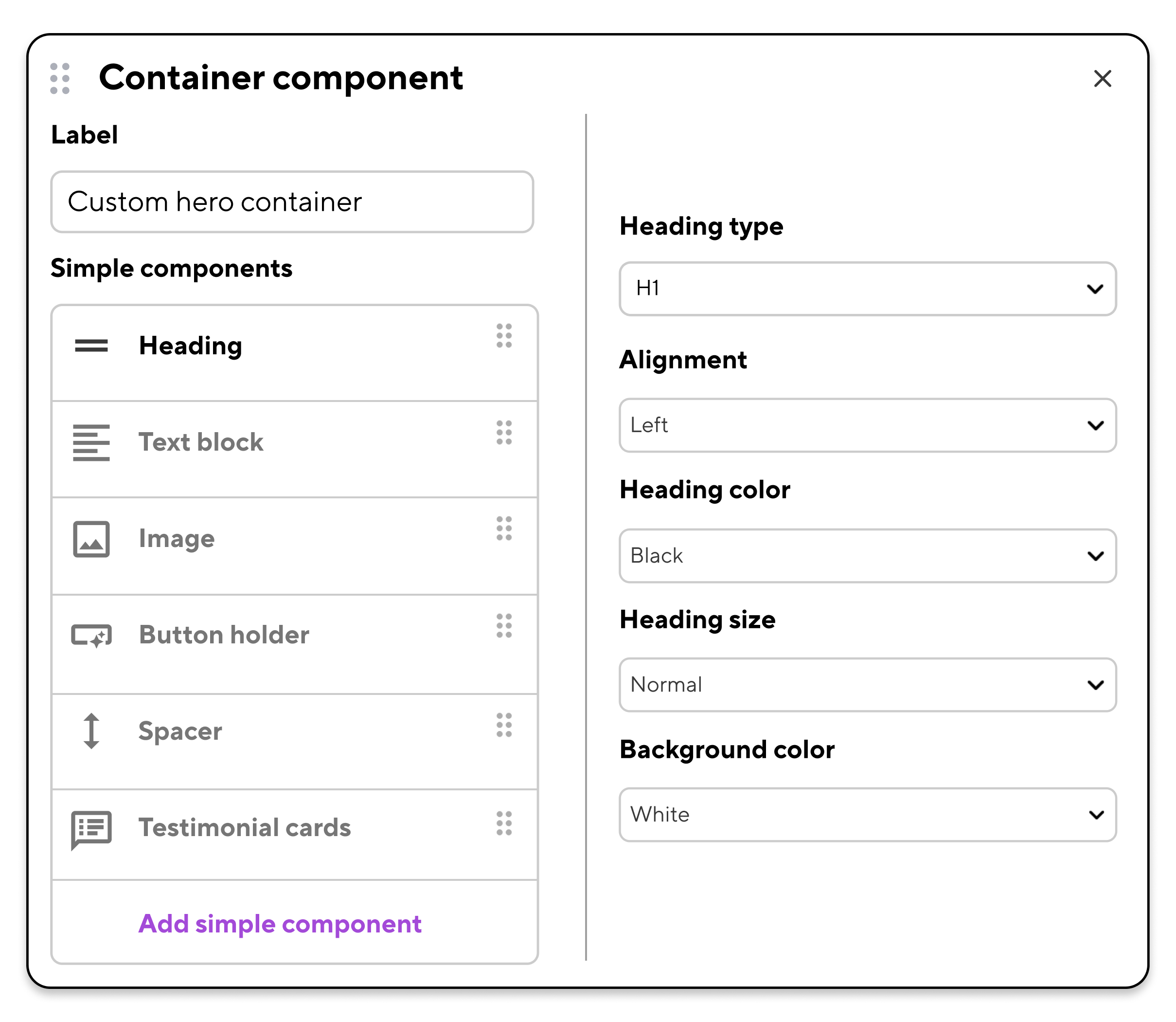
For example, rather than using the same pre-built component with heading, text, and image inputs every time, and risk all of our pages looking exactly the same, we can assemble our own components from their constituent parts, as we need them. We can even nest our container components within other containers, essentially recreating a 'card' component (though to be fair, we've built those too).
Making your components — and your content — responsive Direct link to this section
There are clearly a lot of options we can build into our page components. But there’s more: your components can be created to display different content and/or styles depending on the device type your audience uses.
Responsive styles are pretty standard on the web — and they should be, given the massive proportion of web users that browse on mobile devices and tablets. On CloudCannon we can take this a step further, and add responsive content to the mix.
Your page’s ‘breakpoint’ — the point at which your page displays differently for desktop, tablet, and mobile — can determine what it displays. How? Components can contain different styling rules for each breakpoint, and can even hide and display different content at different breakpoints.
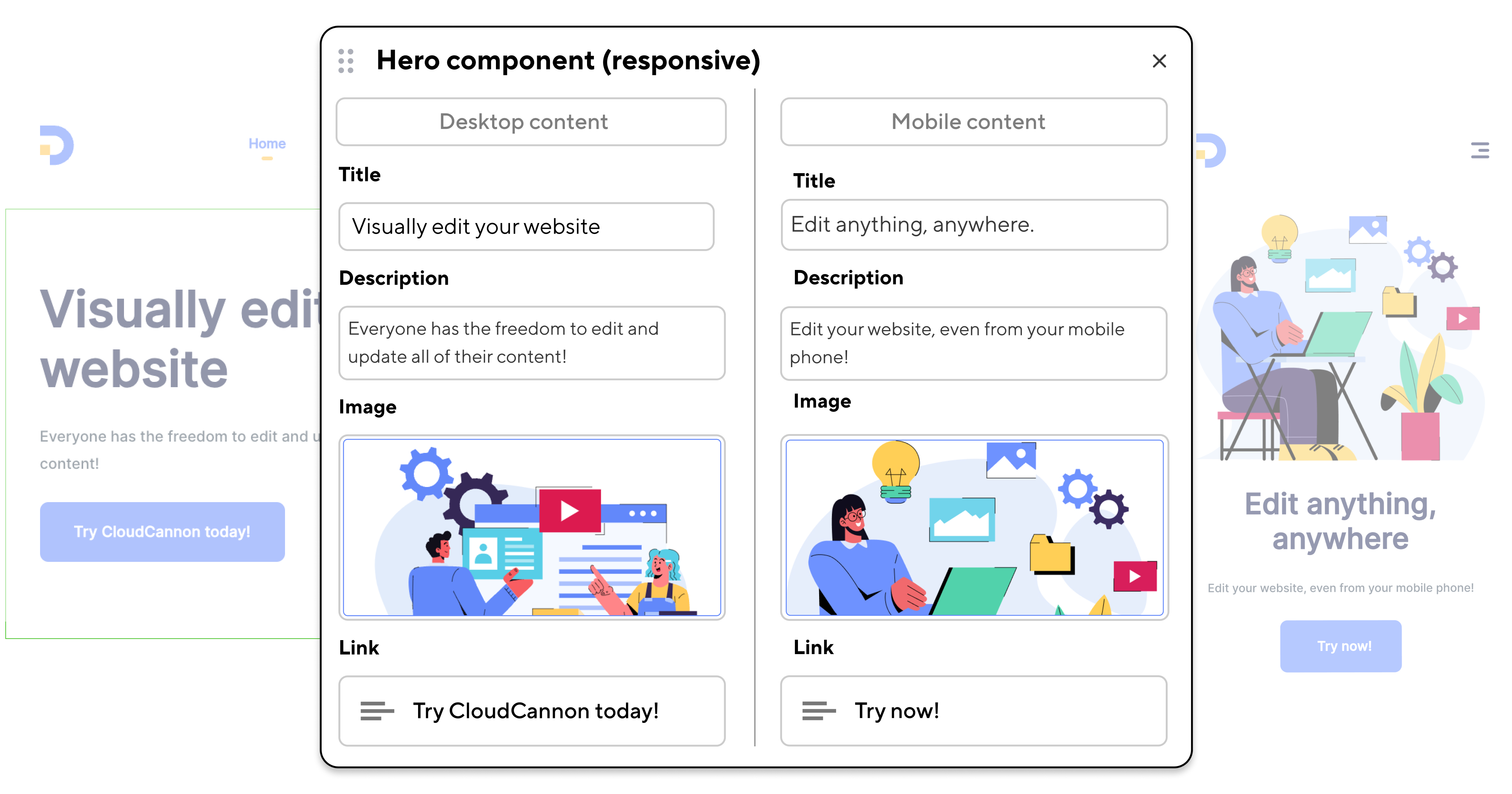
A complicated diagram that looks great on desktop, for example, could be replaced with a simpler version for mobile users. Conversely, headlines that read well on mobile might feel too short on desktop.
A responsive component can include all possible content and style options for a given range of devices, but will only display the correct one. (This, incidentally, is another point in favor of using CloudCannon’s Visual Editor. You can instantly resize your editing window from desktop to tablet or mobile width, and immediately see the appropriate content displayed, and correctly styled for the screen width.)
Choosing where to use visual editing Direct link to this section
Landing pages are ideal targets for visual editing. These pages are among the first that a new visitor to my website might see. They’re probably more likely to feature short copy, images, or interactive components than long-form content, and they should help set the tone for a user’s experience. For these reasons it’s really important that I can build these pages as I view them, in the same context that my prospective audience will see them.
I like grouping my landing pages together as collections, which makes it easier for me and any future editors to find them. Collections on CloudCannon are represented visually as a folder in your sidebar; navigating to a collection shows a preview of each file within that collection.
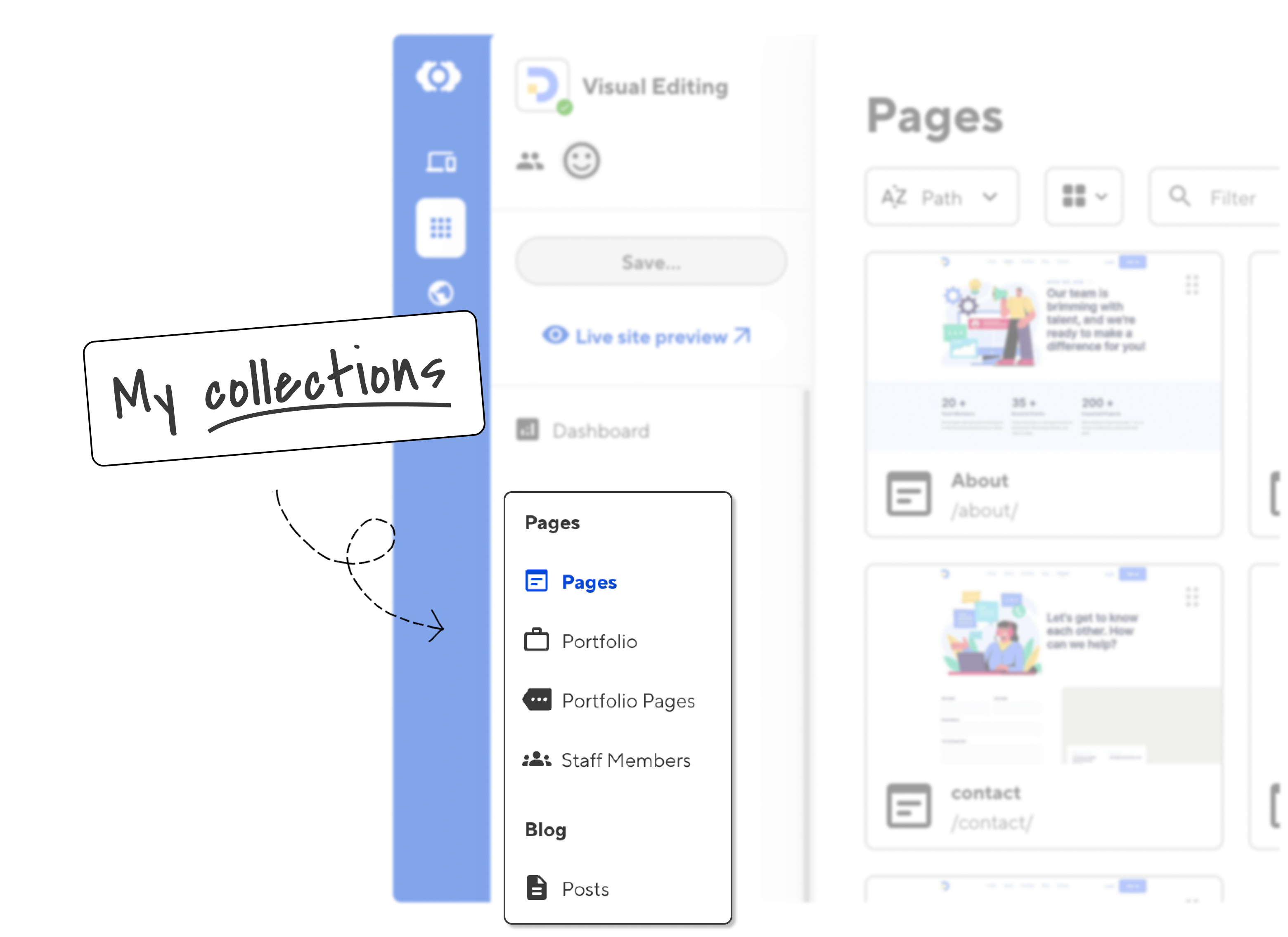
In the above image I've created four collections for my pages, and one for my blog posts. (I'll go into more detail about how I work with posts, and how I set up my Content Editor, in my next article!)
Give your content more context Direct link to this section
By thoughtfully setting up collections, choosing between fixed and flexible components, and leveraging responsive design and content, developers can help content editors efficiently build pages that look great on any device, in any context.
The ability to see your edits in real-time ensures that your pages can appeal to the widest possible audience. And while your specific setup may vary depending on your team’s needs and your brand guidelines, visual editing in CloudCannon offers a powerful and flexible way to create and manage engaging, accessible, and discoverable website content.
Articles in this series
Setting up CloudCannon for success
- How you can optimize your Visual Editor for page building
- How you can optimize your Content Editor for long-form articles
- How you can optimize your CMS for SEO success
- How you can optimize publishing workflows for your content team
Web projects can be hard. We can help.
If you’d like help to create your own components to use on CloudCannon, our solutions specialists can help.


