App Redesign and Custom Organisation Branding

Today we released our rebranding across our app. This includes a large number of usability fixes. Below are the most notable changes:

Organisation Branding Direct link to this section
The new design is developed from the ground up to make it your own. We have made the entire app colour scheme configurable with assets to match. We recommend using our uploading SVG icons to make your teams experience extra crisp.

Branding also effects the client sharing interface. For personal pro accounts, the colour and brand logo are configurable.

User Menu Direct link to this section
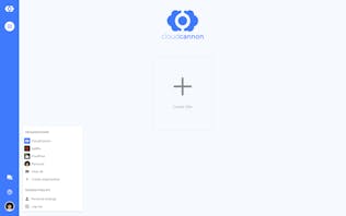
We have moved the user settings into a dropdown which is accessible from the bottom left corner. Click the face to access all the options including a new quick select for swapping organisations.

Status & Reports Direct link to this section
The old site status page is no more. Status has been shifted to the top right corner. This makes build, sync and optimise status easy to check from editor views. This is consistent for the stripped down client interface status. In the sidebar, Status has been renamed to Reports to more accurately reflect the remaining views.

Explore & Edit Direct link to this section
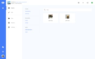
Collections is a great label for Jekyll developers, the problem is editors may not understand this concept. We have renamed this view to Explore which has undergone some minor adjustments. Output collections are now grouped with standalone pages. All other collections are grouped in a data section.

Editor has been shortened to the verb form of Edit to inspire action.
Visual Editing Direct link to this section
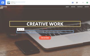
When editing your website we believe the experience should mimic viewing it. The new editor modes are aimed to be distraction free and immersive. When clicking on an editor mode, the content pane will cover the entire width of the screen. To navigate back, the icon in the top left will be replaced with menu icon (either a map or folder icon). Clicking the icon will open the appropriate navigation for the previously opened page. This change is part of an ongoing effort to offer more visual editing options.

We look forward to you making CloudCannon your own. Let us know what you think or if you need any assistance.git push'
Launch your website today
Give your content team full autonomy on your developer-approved tech stack with CloudCannon.


