Now that we've detected the Visual Editor CloudCannon's visual editing interface provides a user-friendly way of updating your website files on an interactive preview of your webpage. You can navigate around your website preview using links/buttons, as you would on the live version, and edit your content inline on the page, or with the data panel or sidebar. What you see in the Visual Editor is what your website visitors will see on your live webpages.Visual Editor
inCloudCannonEditor in the previous step, this interface only renders inside the Visual Editor.
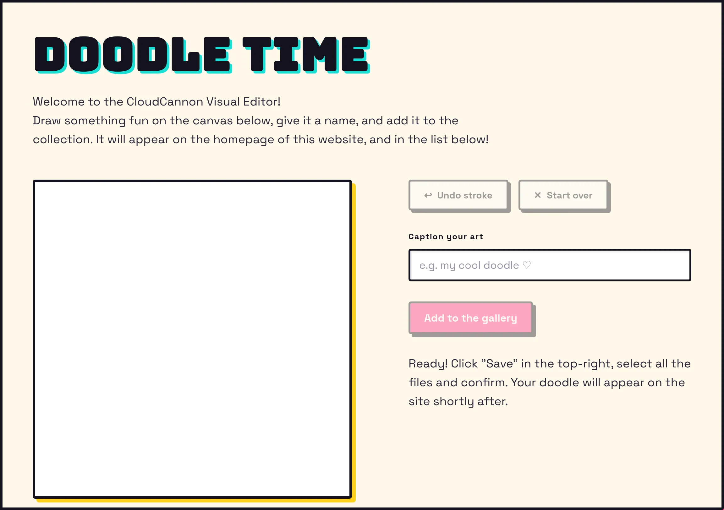
Render whatever markup your interface needs — CloudCannon doesn't require any particular wrapper or class.
return (
  <div className="cloudcannon-visual-editor-component">
    <h1>Why not draw something?</h1>

    <DoodleCanvas
      canvasRef={canvasRef}
      finishDraw={(newPixels: CoordArray) => { setSavedPixels([...savedPixels, [...newPixels]]); }}
    ></DoodleCanvas>

    <label htmlFor="caption">Caption for the new image (required)</label>
    <input type="text" id="caption" onInput={(e) => { setCaption(e.currentTarget.value); }} />

    <button type="button" disabled={!!currentStateMessage || !caption} onClick={submit}>Add to the gallery</button>
  </div>
);The Doodle Gallery styles this wrapper with its own striped background in main.css. The class name isn't special to CloudCannon — use whatever markup and styling you like.
DoodleCanvas is a plain React component that captures the drawing and hands the strokes back through finishDraw. None of its code touches the Visual Editor API.
Capture the caption an Organization Member types. We'll save it alongside the image.
The submit button calls our submit() function, which we'll cover in the next steps of this guide. It's disabled until an Organization Member enters a caption, and stays disabled while a save is in progress, so they can't start a second save before the first finishes.
The Doodle Gallery renders this component on its homepage. In Astro, that means importing it and rendering CloudCannon's Visual Editor API is a public JavaScript API for building custom integrations with the Visual Editor. It lets you run your own code inside the Visual Editor to read and write content, listen for changes, and upload files using code running inside your website files.<Doodler client:load /> — the client:load directive hydrates the component in the browser, where it can reach the Visual Editor APIVisual Editor API
---
import { Doodler } from "../components/doodle.tsx";
---

<Doodler client:load /> Import the component into the page where you want the tool to appear.
Render it with client:load so the component hydrates in the browser.
Bringing your own UI like this gives you complete control over the experience. If instead you want to reuse CloudCannon's native editing surfaces, the Visual Editor API can also open its own Data Panels A Data Panel is a panel of Inputs for editing a focused scope of structured data, such as image details, link attributes, or Site configuration. Data Panels appear in several places across CloudCannon — in the Visual Editor, in the Content Editor when you edit a snippet, image, or link, and in Configuration Mode, such as the Edit Advanced panel. Developers can also build custom Data Panels with full Input support using the Visual Editor API.Data Panel
In the next step of this guide, we'll start building the submit function, beginning by uploading the finished doodle as an image.