Currently, Component Editable Regions are only available for Astro and React. We are working to support more types. Please get in touch with our friendly support team to make a request.
Many static websites use reusable code components (a.k.a., partials) ranging from a small snippet of HTML, to UI elements like a header, profile card, or an entire page layout.
You can use the Component Editable Regions to re-render changes to your components in the Visual Editor, or enable inline editing of component text and images in conjunction with other Editable Regions. Let's cover how to define one.
Nested text or image values
To avoid data-prop misconfiguration errors, it is best practice to define your Editable Regions from the root of your file first (i.e., from parent elements to child elements). If you want to edit text or image values in a component using the Visual Editor, you should define your Component Editable Region on the parent element before Text and Image.
Install the NPM package#
Before you can use Component Editable Regions, you will need to install CloudCannon's Editable Regions NPM package.
With your website project open in your local development environment, run the following command in your terminal:
npm install @cloudcannon/editable-regions
React is a dependency of this package. You may need to use npm i to install React if your local development environment is out of date.
For more information, you can visit CloudCannon's GitHub repository for the Editable Regions NPM package.
Update Astro config file#
If you use Astro, add the Editable Regions integration to your Astro config file:
import editableRegions from "@cloudcannon/editable-regions/astro-integration";
import { defineConfig } from "astro/config";


export default defineConfig({
  integrations: [editableRegions()],
});
Register your components#
Next, you need to register your components with the NPM package. To do this, you'll need to create a registration script and include it in your layout.
If you use .astro component files, even if you have React components nested in them, you will need to import { registerAstroComponent } in your registration script. Here's an example for the CTA component.
import { registerAstroComponent } from '@cloudcannon/editable-regions/astro';
import '@cloudcannon/editable-regions/astro-react-renderer';
import CTA from '../components/CTA.astro';

// Register your components
registerAstroComponent('cta', CTA);
This import is only necessary if you use React components nested inside your Astro components.
If you use .tsx or .jsx component files, you will need to import { registerReactComponent } in your registration script. Here's an example for the CTA component.
import { registerReactComponent } from '@cloudcannon/editable-regions/react';
import MyComponent from './MyComponent.jsx';

registerReactComponent('my_component', MyComponent);
Registering your components tells CloudCannon that those components should be bundled for client side use in the Visual Editor.
Components in layout files#
Components use templating to reference structured data keys. Layout files then reference a component file. At build time, CloudCannon populates the component with the correct values and outputs it to the layout's HTML webpage.
Let's take a look at an example.
This file is a blog post, containing the cta object to the front matter, and the structured data keys description, link, buttonText, and buttonColor.
---
title: 'First post'
author: 'C. Kent'
heroImage: '../../assets/blog-banner.jpg'
heroImageTitle: 'Blog gradient'
heroImageAlt: 'An eye-catching color gradient banner.'
cta:
  description: "Need a little more help? Send a message to our friendly support team."
  link: "https://www.cloudcannon.com/support/"
  buttonText: "Send a message"
  buttonColor: "#034AD8"
---

Lorem ipsum dolor sit amet, consectetur adipiscing elit, sed do eiusmod tempor incididunt ut labore et dolore magna aliqua. Vitae ultricies leo integer malesuada nunc vel risus commodo viverra.
Here is an excerpt from our blog layout file, containing a Call-To-Action component called CTA at the bottom of every blog post.
---
import CTA from '../components/CTA.astro';
---

<html lang="en">
	<body>
		<main>
			<article>
                <!-- Blog HTML here -->
			</article>
			<CTA {...Astro.props.cta} />
		</main>
	</body>
</html>
The <CTA> component uses structured data in the front matter of the files in the Blog collection.
Finally, here's our component layout file, which contains HTML for the component and templating to populate elements with values from each blog file.
---
const { description, link, buttonText, buttonColor } = Astro.props;
---

<p>{description}</p>
<a href={link}>
    <button style={`background-color: ${buttonColor}`}>{buttonText}</button>
</a>
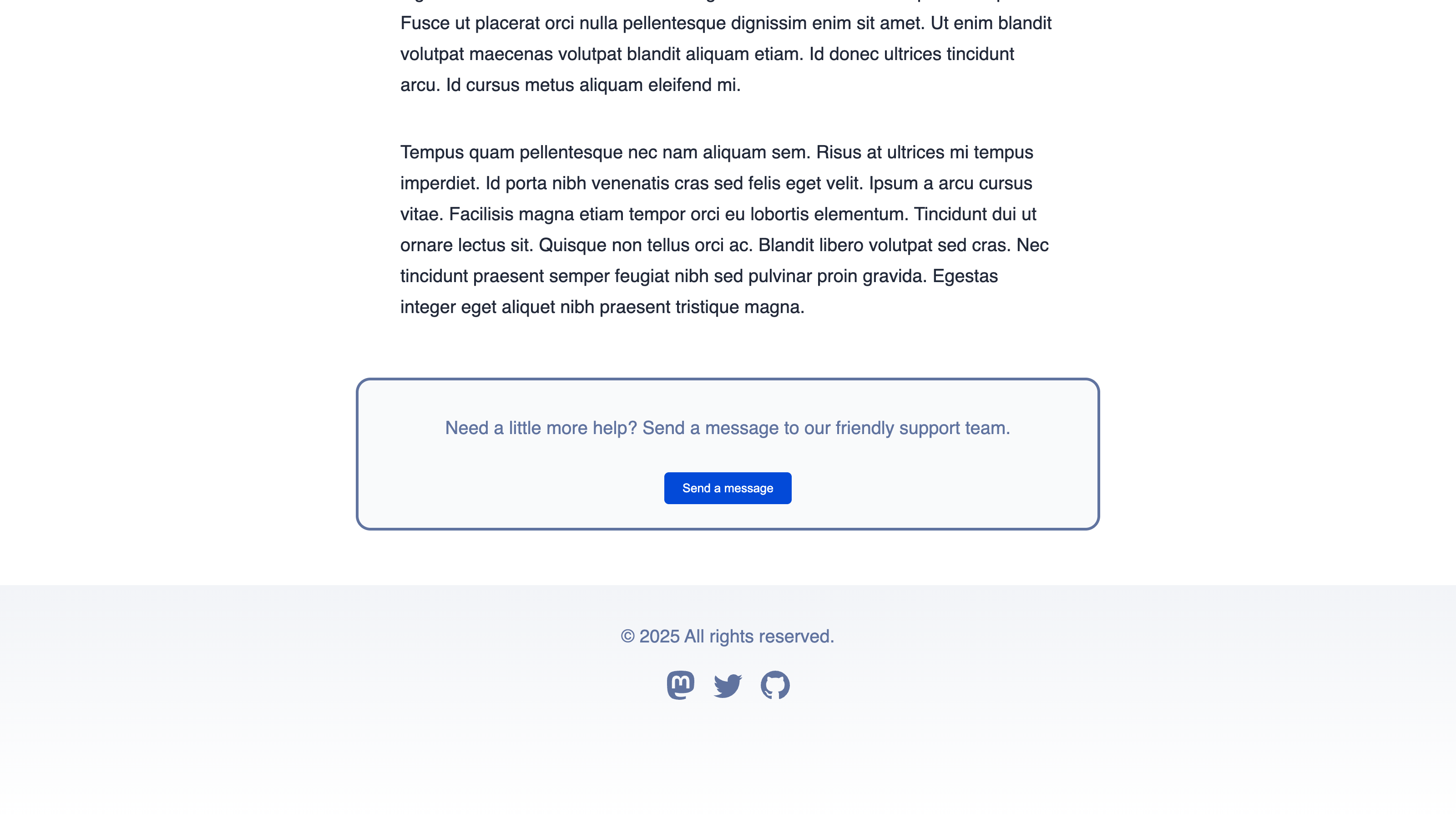
Together, these files output a webpage that looks like this:

In this example, the <CTA> component uses the properties in the cta object in each blog post. We can add a Component Editable Regions to our layout file to enable the Visual Editor to re-render any changes made with the data panel or sidebar.
First you need to import the component registration file you made earlier with a <script> HTML element. The <script> element should go inside the <body> element of your layout, which could be a different file depending on how your Site is structured (e.g., you may have a base layout file that all your other layouts reference). When you import the component registration file, you can also add instructions to check if your browser window is in Editor Mode (i.e., your webpage is open in CloudCannon's Visual Editor) and add an error warning.
Next, since the <CTA> component lacks an appropriate parent DOM element, you should wrap it in the <editable-component> web component. Our Component Editable Region also needs a data-prop to define where our component data is stored which, in this case, will be the cta front matter object in our blog post.
Finally, you need to add the data-component HTML attribute to define which registered component we are using which, in this case, is also called cta.
Here's what our Blog Layout code should look like:
<html lang="en">
  <body>
    <script>
      if (window.inEditorMode) {
        import("../scripts/register-components.js").catch((error) => {
          console.warn("Failed to load CloudCannon component registration:", error);
        });
      }
    </script>
    <main>
      <article>
        <!-- Blog HTML here -->
      </article>
      <editable-component data-prop="cta" data-component="cta">
        <CTA {...Astro.props.cta} />
      </editable-component>
    </main>
    <Footer />
  </body>
</html>
The <script> element instructs your browser to import the register-components.js file if your webpage is open in the Visual Editor.
The editable-component web component defines a Component Editable Region. The data-prop attribute defines the path to the data we want to edit, and the data-component defines which registered component we are using. In this case, we want to edit the cta structured data key in the blog front matter and use the registered component cta.
If we were to save and rebuild our Site now, the Visual Editor would allow you to re-render the CTA component when you edit values using the data panel or sidebar, but would not allow inline editing for the text values description and buttonText. To achieve this, we also need to add Text Editable Regions to the CTA component file.
Here's what our CTA component code should look like:
---
const { description, link, buttonText, buttonColor } = Astro.props;
---

<p data-editable="text" data-prop="description">{description}</p>
<a href={link}>
    <button data-editable="text" data-prop="buttonText" style={`background-color: ${buttonColor}`}>{buttonText}</button>
</a>
This <p> element contains data-editable="text" and data-prop="description" to define a Text Editable Region.
This <button> element contains data-editable="text" and data-prop="buttonText" to define a Text Editable Region.
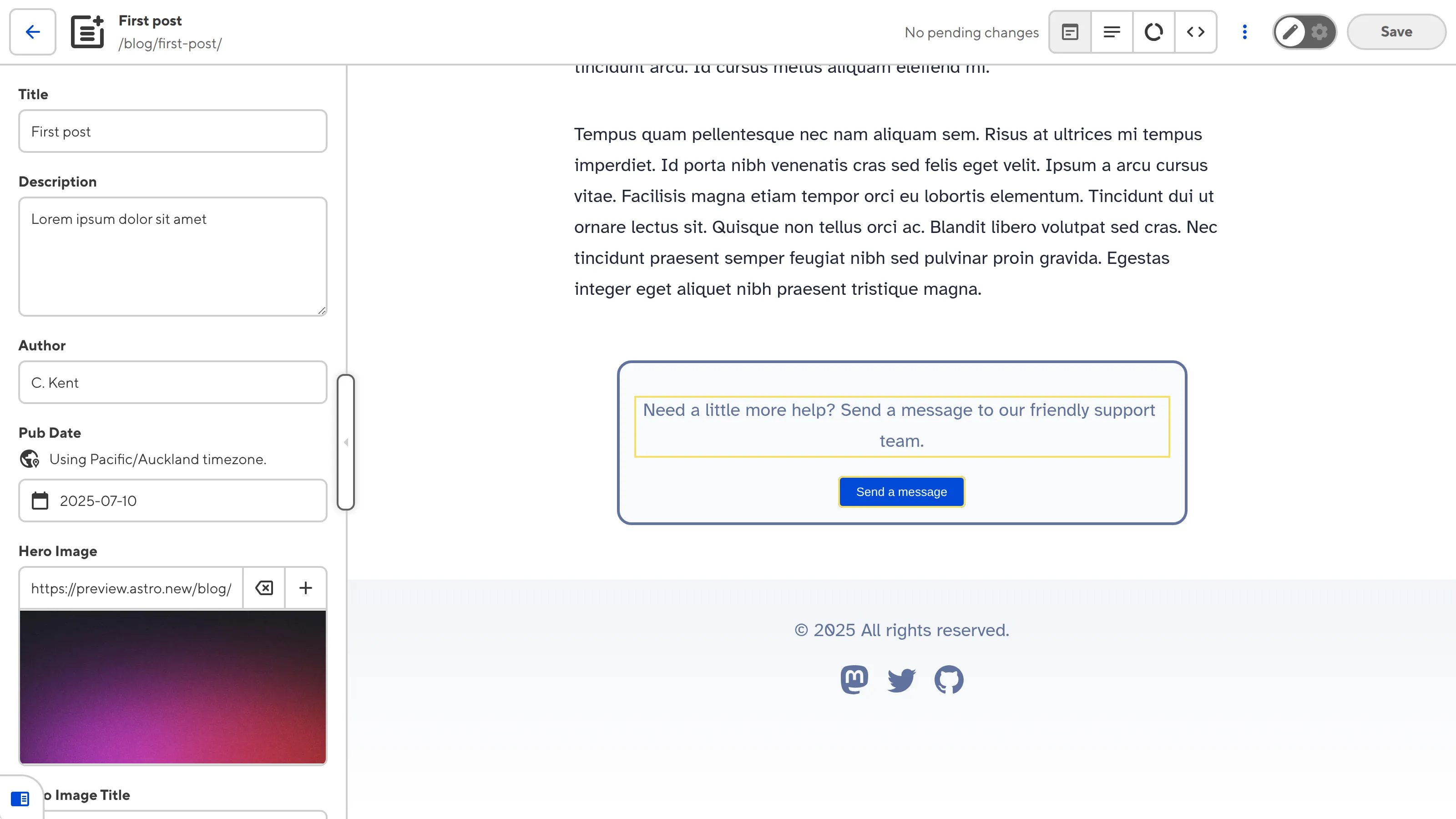
Once we save and rebuild our Site, CloudCannon will show a yellow Editable Regions box around all the content inside the <CTA> component in the Visual Editor. There are also two Text Editable Regions around the description and button text.

When you click into the Editable Region, CloudCannon will open a data panel with inputs for all four structured data keys in the component: description, link, buttonText, and buttonColor.
Common errors#
If you accidentally misconfigure your Editable Regions, CloudCannon will display a red warning box in the Visual Editor.
Here are a few common errors you might encounter with Component Editable Regions:
- You did not define the
data-propordata-componentHTML attributes. - The Editable Region has an invalid data type (e.g., your Text region has a number or object, instead of a string).
- You reference a component that does not exist, or has not been registered.
- Component rendering errors
- Invalid component return values
In the next step of this guide, we'll cover how to define Editable Regions for complex arrays.